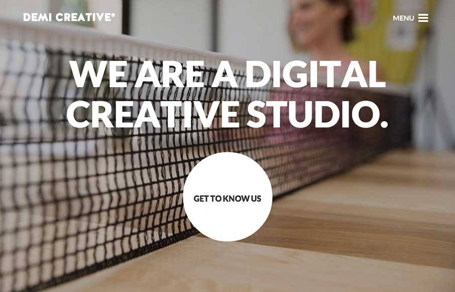
by Gene Crawford | Oct 21, 2014 | Design Firm, Gallery
Big bold visual style for Demi Creative. I dig it. I like the simplicity implied into the site design, the main link is the “get to know us” call to action and it draws you in. The nav under the hamburger icon feels slightly lost but once you dig into the...
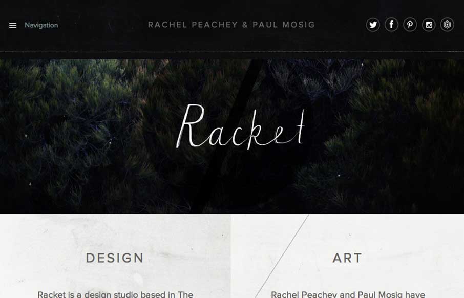
by Gene Crawford | Oct 16, 2014 | Design Firm, Gallery
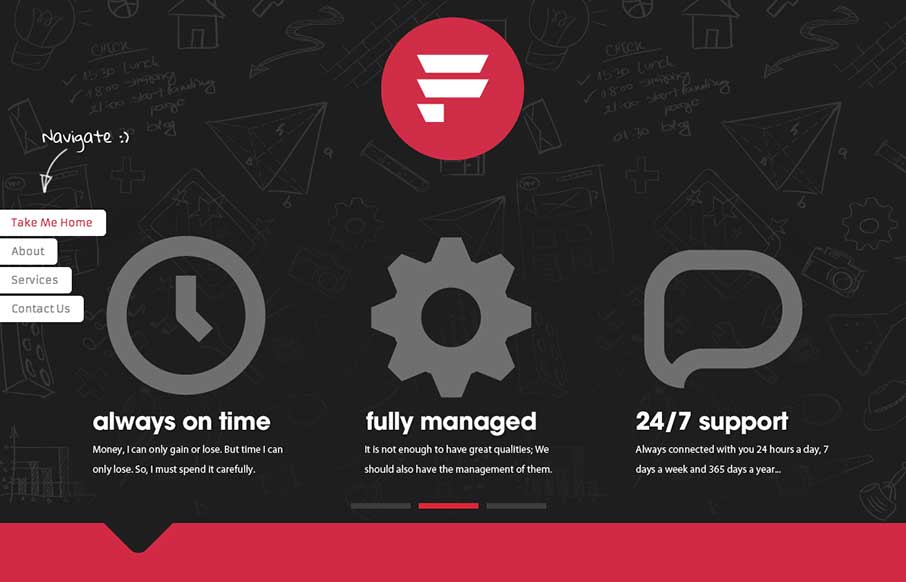
I love the dark and light mixed on the page here. The hand written type is very nice and makes the work gel as well. Lovely responsive approach finishes off a really nice website. Submitted by: Paul Mosig @r_a_c_k_e_t Role: Designer & Developer Re-design of Blue...
by Gene Crawford | Oct 9, 2014 | Design Firm, Gallery, Marketing Company
Nice little details here, like the way the main nav scales down in size as you scroll down and then comes back as you scroll back up. Nice grid layout with some bold graphics and overlay interactions. This is our digital design agency website. I wanted to utilise all...
by Aaron Griswold | Oct 7, 2014 | Design Firm, Gallery, Marketing Company
The vibrant images in the slider really help to sell the rest of the one page site. The interaction of the form fields are pretty cool too. Submitted by: ORO Digital Role: Designer & Developer
by Aaron Griswold | Oct 3, 2014 | Design Firm, Gallery
This is a case of the ubiquity of the internet. Maybe it’s because I live in a place that has a lot of “first-world” problems, but I was pleasantly surprised when I saw that Fiasam is based out of Pakistan. Besides the fact that this is a simple,...
by Gene Crawford | Sep 18, 2014 | Design Firm, Gallery
Pretty cool looking page design for this WP plugin. I like the branding and the visual layout of the page too. Good stuff. Anyone tried the plugin?