
by Gene Crawford | Nov 25, 2015 | Design Firm, Gallery
If you like lavish visuals and solid yet simple typography then the DK site is for you. It’s chock full of custom videography and really is a clinic for us all to see how to use it within a web page. Solid work and really solid website for this digital firm....
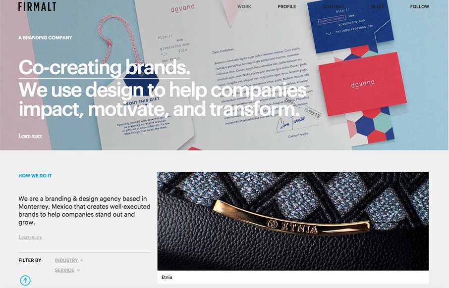
by Gene Crawford | Nov 24, 2015 | Design Firm, Gallery
Nice grid based layout for Firmalt. I like the Masonry like treatment of the main image blocks as you scroll down the page and shift screen sizes. Nice solid simple layout always wins!

by Gene Crawford | Nov 16, 2015 | Design Firm, Gallery
What a great vibe this site design gives off. I love the structured yet disparate looking sections. The way the logo overlaps the scrolling content is visually intriguing as well. Strong stuff.

by Gene Crawford | Nov 5, 2015 | Design Firm, Gallery
The Post Family website looks great on desktop, I love the wide open feeling and the play of the large headlines on the background images and patterns. It loses some of that luster on the smaller screen versions, however it is still easy to use and get to...

by Aaron Griswold | Oct 14, 2015 | Design Firm, Gallery
Cool looking red, blue and white agency site out of Montreal from Ellpi. It’s very simple and clean, with good white (red) space. I like how the video backgrounds on the site are not featured, they are more like footers on interior pages. From the Designer:...

by Aaron Griswold | Oct 6, 2015 | Design Firm, Gallery
There are times when we see sites like the Indicius, and I think – way too busy, what’s going on… I don’t feel like that with this one – especially since there is no other navigation on the site. Really love the movement of the Case Study...