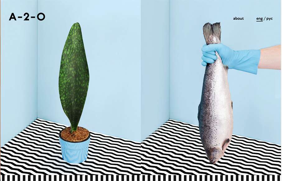
by Gene Crawford | Oct 5, 2015 | Design Firm, Gallery
Pretty unique interaction choices on A-2-). It’s different, i’m not sure it doesn’t work though. I like how the cursor changes based on moving over a link, I don’t like how this is a 100% diversion from what the user has always experienced....
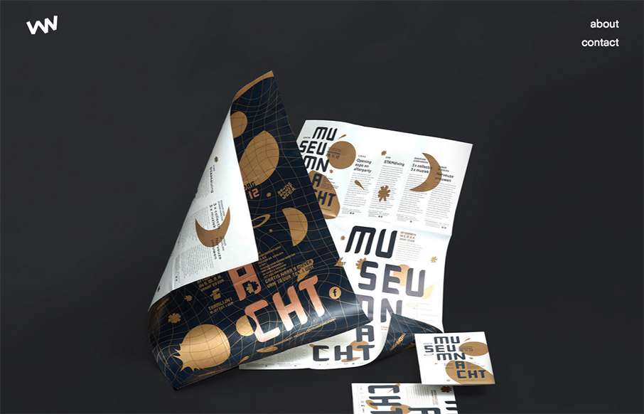
by Gene Crawford | Oct 1, 2015 | Design Firm, Gallery
Really simple layout, it’s like one project at a time to check out then only 2 other simple nav items. I love this approach. I don’t like the bottom “read more” link, I’d like it to be more obvious across all images used for this section....
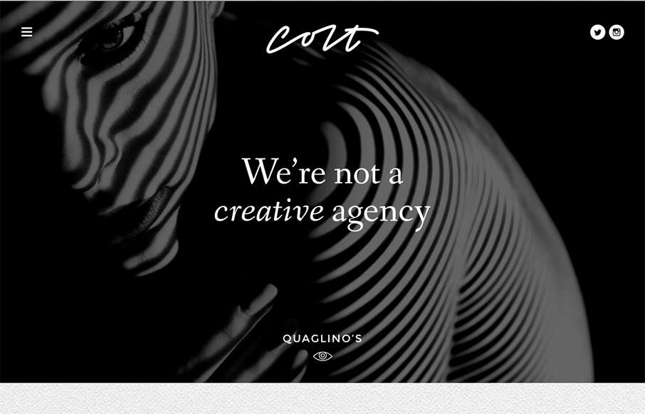
by Gene Crawford | Sep 28, 2015 | Design Firm, Gallery
This site design hits all the “now” standard things design and interaction wise. But sometimes you get it just right, I love the smooth feeling vibe to this site and the imagery is quite nice. The way the case study images load as you scroll for the first...
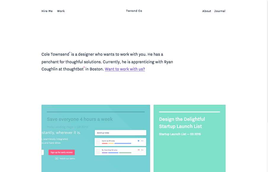
by Gene Crawford | Sep 17, 2015 | Design Firm, Gallery
Nice minimal site design. I like the blocks of content and how they keep you focused as you review the home page. I’m not huge on the way they handle when you scale down for mobile screen widths, but overall it’s smooth and works great across whatever...
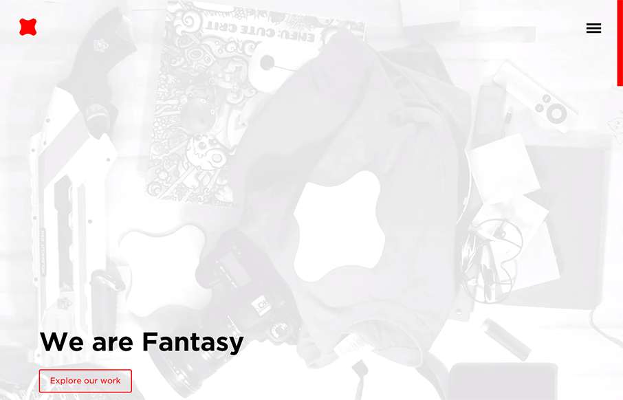
by Gene Crawford | Sep 9, 2015 | Design Firm, Gallery
Newly updated (not sure how long) design for Fantasy Interactive. It’s amazing to me to see this design, i’ve followed Fantasy for the entire time they’ve been around. You can almost track the times in design from their websites over the years. this...
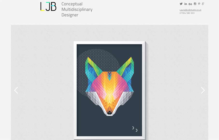
by Aaron Griswold | Aug 31, 2015 | Design Firm, Gallery
Cool portfolio design from Laura Boast of LJB Studio out of Manchester (UK), built by Nine Sixty. One thing I really like is how the home page has no nav in order to draw more attention the work in the slideshow – but nav comes up in the sticky header when you...