
by Gene Crawford | Sep 22, 2015 | Community / Social Networking, Gallery
Really nice and clean layout for the Atlanta Tech Village website. I like the way they are showing you people in the space, with photos and video background, etc… the home page keeps you streamlined and puts what people would want to know most up front. This...
by Aaron Griswold | Jun 16, 2015 | Community / Social Networking, Gallery
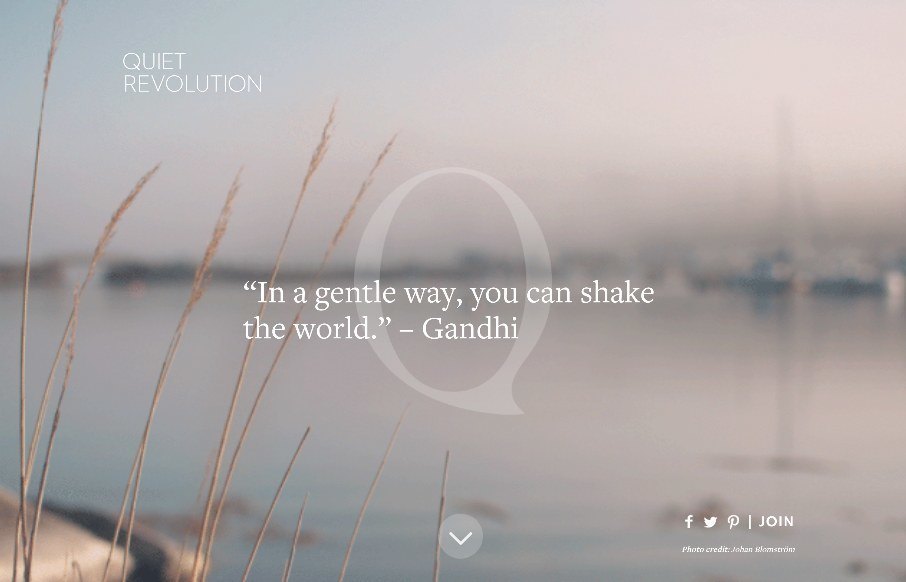
As extroverted as I can be sometimes through my writing, among friends and family, and when I’m acting – I actually have an introverted nature in many social situations. That’s part of the gist of the Quite Revolution (from a philosophy standpoint),...
by Aaron Griswold | Apr 15, 2015 | Community / Social Networking, Gallery
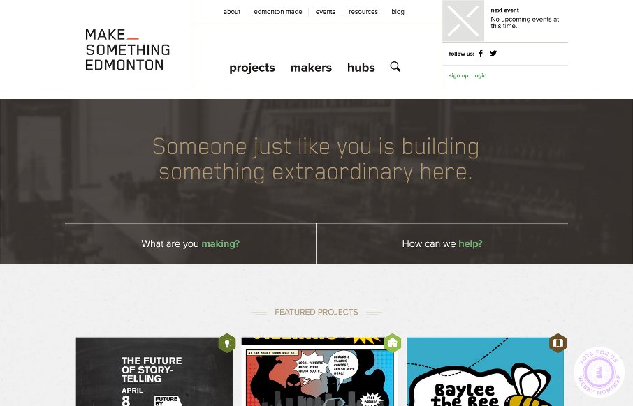
Love when a community project gains momentum like the Make Something Edmonton project has. The design is excellent all the way through – take a few moments to “flip” through the site – it’s not like other sites we see here at UMS –...
by Gene Crawford | Nov 29, 2012 | Community / Social Networking, Gallery
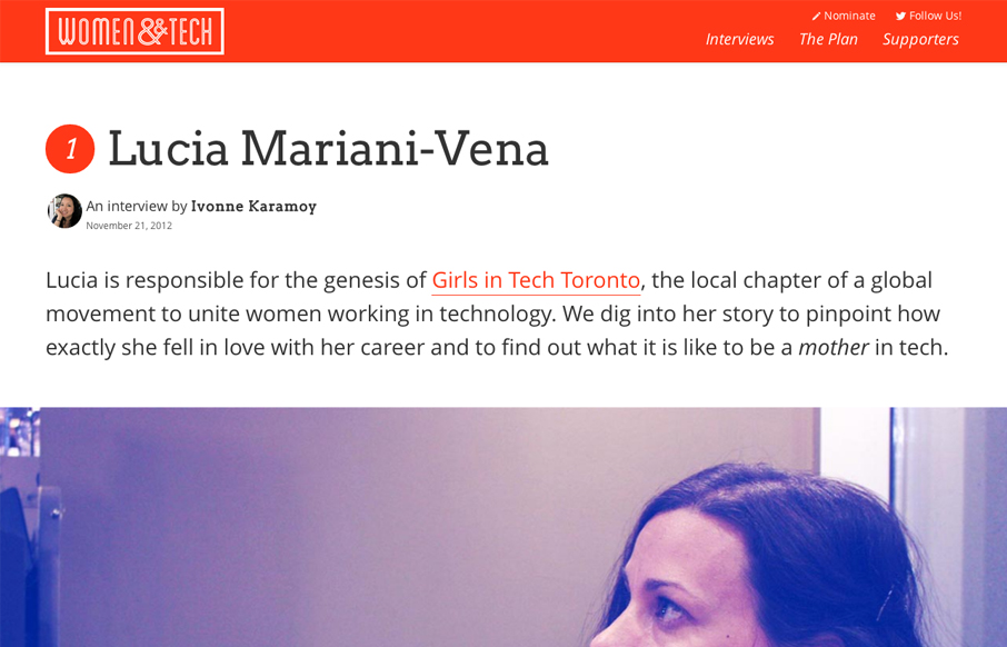
Brilliant layout for the Women & Tech website. It’s a gorgeous long form narrative based content site with a responsive wrapper. I love it. It’s also a really great service for the community at large.
by Giovanni DiFeterici | Aug 2, 2012 | Community / Social Networking, Gallery
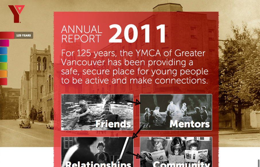
imagineourymca.ca is clearly designed to push the brand and to present a lot of information in a tight little package. I really like how the ‘pages’ have so much activity without getting in the way of the content. I especially enjoy the community sections...
by Gene Crawford | Nov 15, 2011 | Community / Social Networking, Gallery
There are two things that I find engaging with this website design. First is the search, or “browse”, design. It looks very much like a large search bar, but is broken down with two select boxes. It is rather intuitive and even though it could just sit...