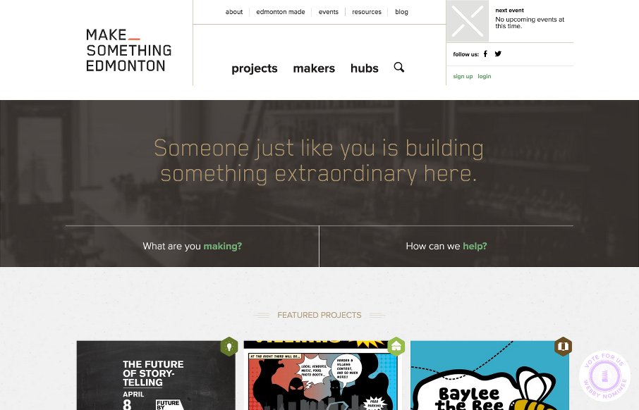
by Aaron Griswold | Apr 15, 2015 | Community / Social Networking, Gallery
Love when a community project gains momentum like the Make Something Edmonton project has. The design is excellent all the way through – take a few moments to “flip” through the site – it’s not like other sites we see here at UMS –...
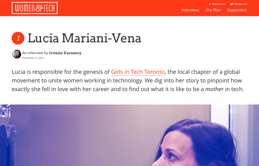
by Gene Crawford | Nov 29, 2012 | Community / Social Networking, Gallery
Brilliant layout for the Women & Tech website. It’s a gorgeous long form narrative based content site with a responsive wrapper. I love it. It’s also a really great service for the community at large.
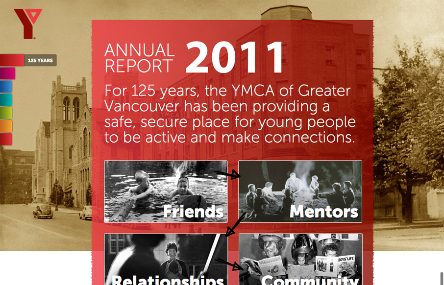
by Giovanni DiFeterici | Aug 2, 2012 | Community / Social Networking, Gallery
imagineourymca.ca is clearly designed to push the brand and to present a lot of information in a tight little package. I really like how the ‘pages’ have so much activity without getting in the way of the content. I especially enjoy the community sections...
by Gene Crawford | Nov 15, 2011 | Community / Social Networking, Gallery
There are two things that I find engaging with this website design. First is the search, or “browse”, design. It looks very much like a large search bar, but is broken down with two select boxes. It is rather intuitive and even though it could just sit...
by Maria | Nov 8, 2011 | Community / Social Networking, Gallery
What I love about this site immediately is that there are several obvious ways to dig in and use it whether you’re seeking a professional or a professional who wants to be sought. The header carousel is smartly used. It doesn’t take up a lot of real estate, though you...
by Gene Crawford | Jun 23, 2011 | Community / Social Networking, Gallery
Very strong layout and design work here. I love the colors the most on this site I think. The navigation is clean and concise, even with the extra descriptive text. The footer is crowned with some well done illustrations too. Very nice. The responsive design of the...
