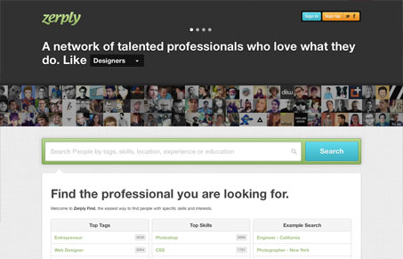
What I love about this site immediately is that there are several obvious ways to dig in and use it whether you’re seeking a professional or a professional who wants to be sought. The header carousel is smartly used. It doesn’t take up a lot of real estate, though you can learn and accomplish just about everything within that space. Especially nifty is the horizontal sign up form. It’s a great use of space, not just because it “fits” in the area, but it plays nicely into the interaction of the forward advancing slides. There are tons of details that make this a fun site with a polished look. The concept of the Zerply app is great and it’s nice to see that uniqueness and tailored simplicity carried throughout the site.


0 Comments