by Maria | Sep 27, 2012 | Food and Beverage, Gallery
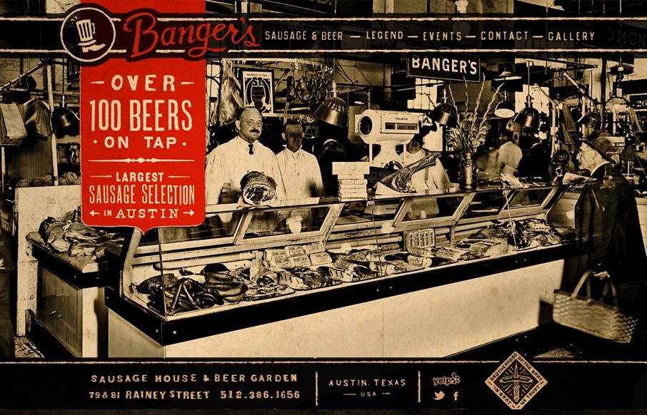
Such a visually rich design. I love the distressed graphic feel to this and the red really makes it “pop” (that was sarcasm, did I just make some of you designer’s brains explode?). It looks like there’s a slight parallax with the background...

by Maria | Sep 17, 2012 | Gallery, Travel
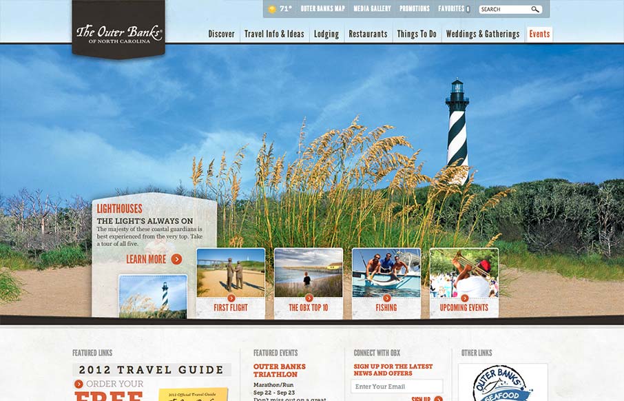
Really slick vacation marketing site for The Outer Banks of NC. I like the hero area slide show’s interactions, they’re quite involved but they look tempting to click around on. The mid area feels a bit cramped with the 4 columns at first but they’ve...

by Maria | Sep 13, 2012 | Food and Beverage, Gallery
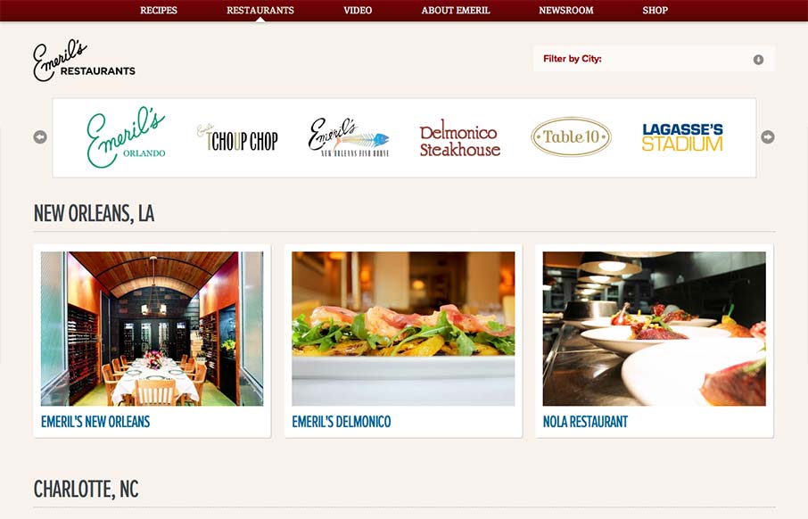
Aside from the oddity of having different sites/URLs in the main nav, the restaurant “site” is really nice. It has a clean design with gorgeous imagery (cuz let’s face it, Emeril’s food is a dream) and a great layout of information. It’s...

by Maria | Sep 12, 2012 | Gallery
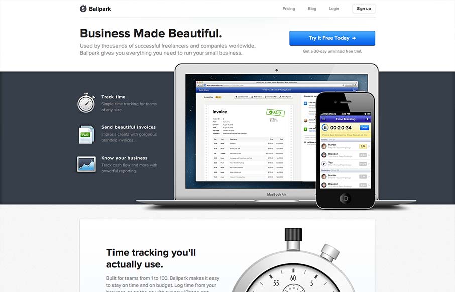
incredibly elegant getballpark.com — Matthew Smith (@whale) August 15, 2012 Take away the beautiful aesthetic and you’re left with a clearly defined product page. The copy is straightforward enough to be informative, and polished enough to be engaging on its...

by Maria | Sep 10, 2012 | Gallery
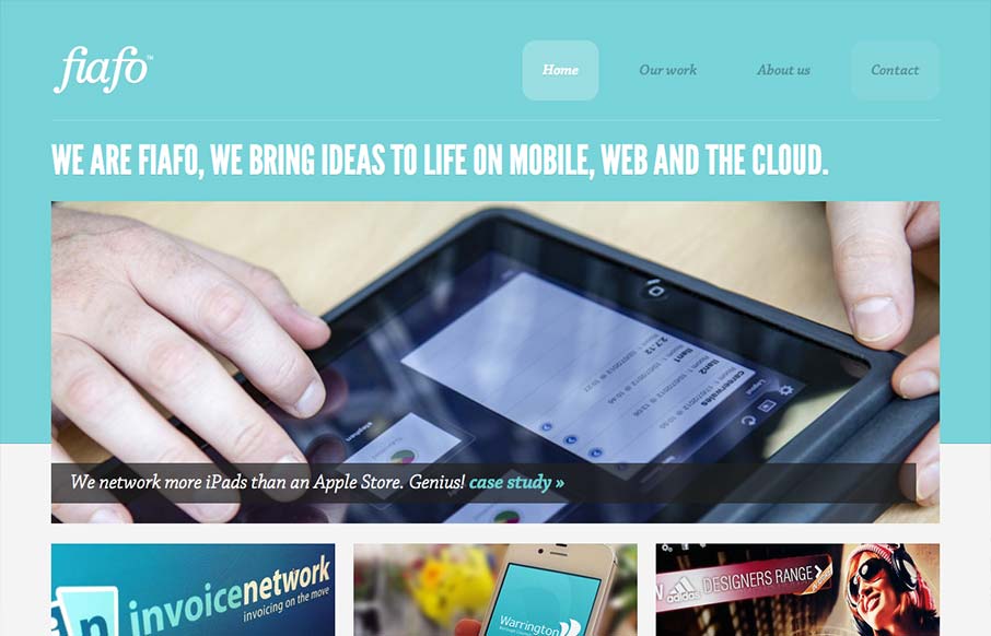
There’s a pretty structured grid feel going on here. The use of League Gothic emphasizes the grid weight, but Chaparral Pro is a welcomed contrast. I think both typefaces are executed well enough to marry the crisp imagery with the fun illustrations. I like the...
