by Maria | Aug 31, 2012 | Gallery
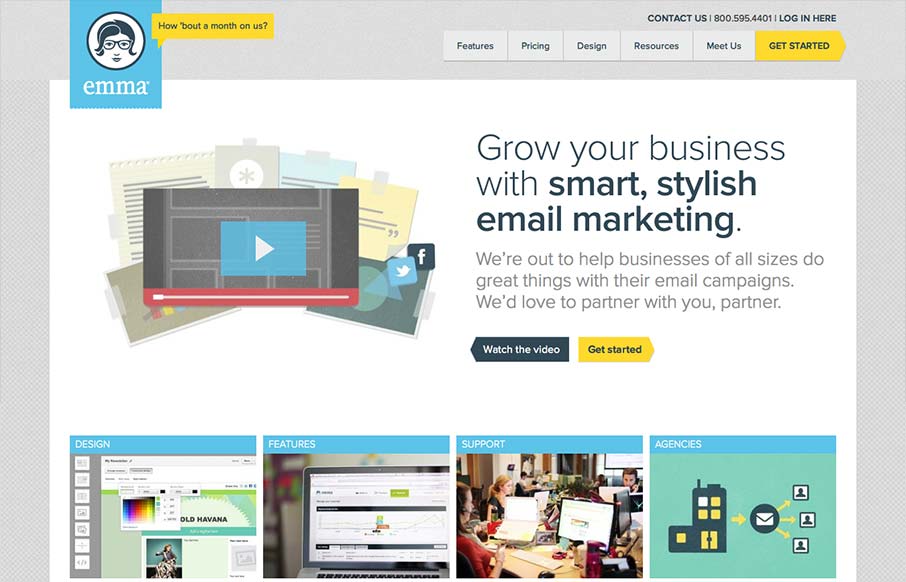
The emma website is very crisp. I dig that top nav and how crisp and brite it looks to me. The “get started” call to action is easy to find and understand and I like that it’s echoed on the page a couple of times. The overall layout gets more dense...

by Maria | Aug 31, 2012 | Gallery
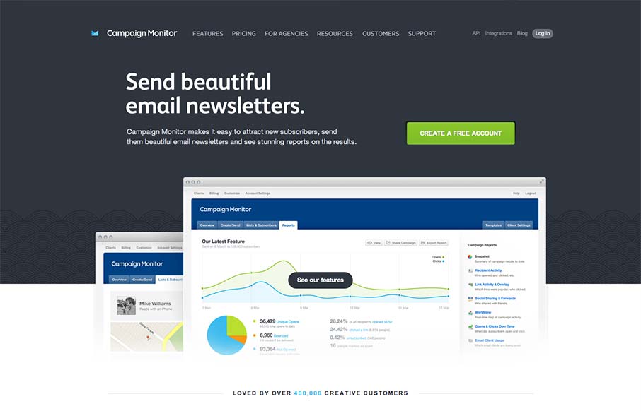
Such a great clean and clear experience. I love the overall simple approach, keeping the visual noise to a minimum, it’s totally different in approach to most product websites like this. The call to action is super clear and concise but doesn’t beat you...

by Maria | Jul 30, 2012 | Gallery
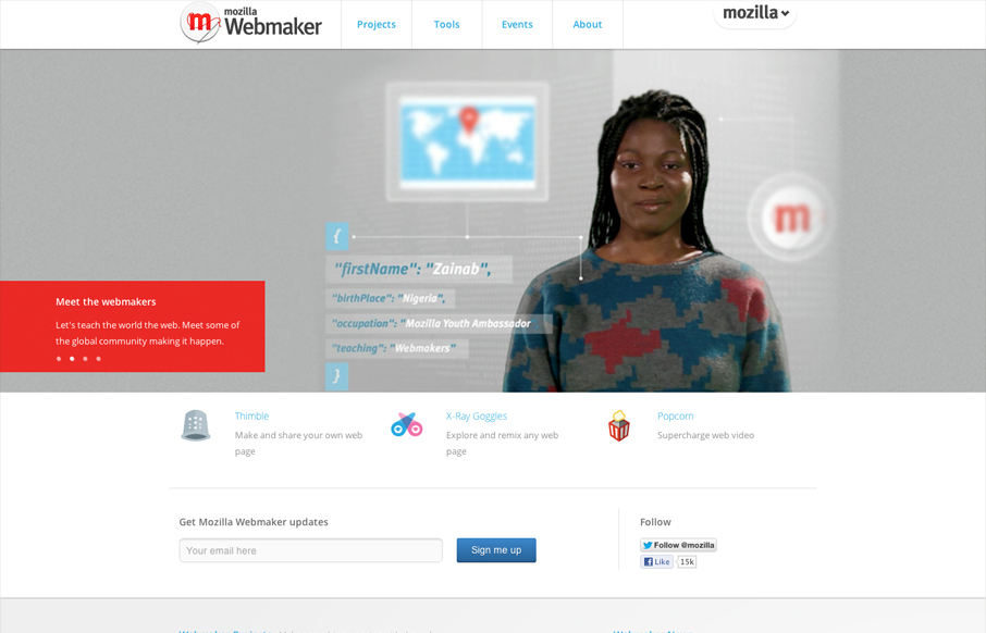
Nice clean and straight forward design for the Mozilla Webmaker website. Some interesting responsive navigation changes too. Wonder why they chose to drop that big selection nav off the Mozilla logo on smaller screen sizes. Overall I like the minimal feel to it while...
by Maria | Jul 9, 2012 | News
If you’ve been following Jenn Downs (@beparticular) from MailChimp, whether online or at a conference or meetup, you know that she’s been doing some pretty fantastic things with usability testing on mobile devices. Most recently, Jenn was up at the...

by Maria | Jul 2, 2012 | Design Firm, Gallery
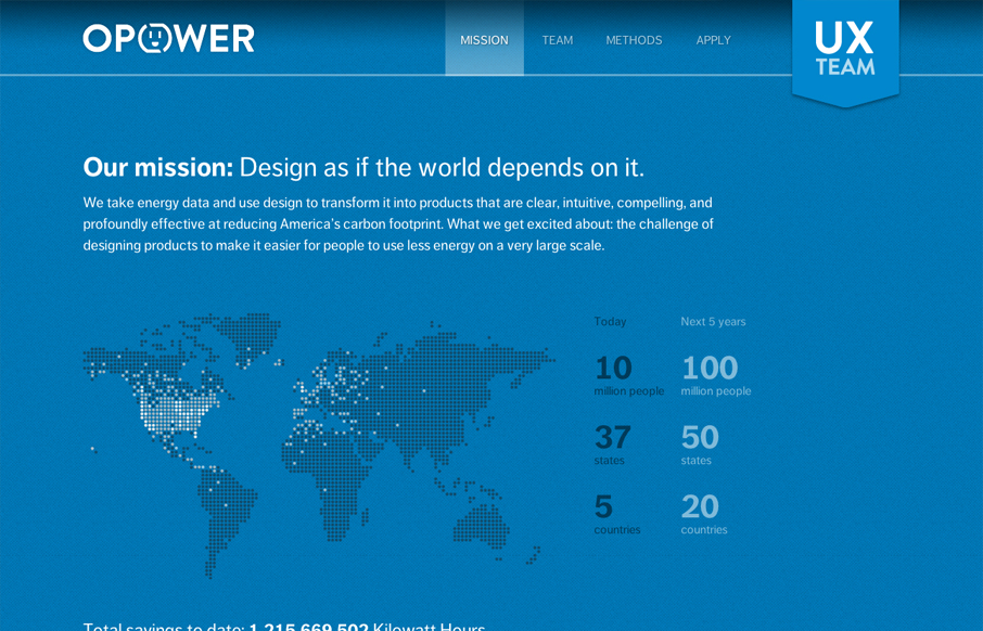
Digging the new Opower UX team site bit.ly/LBtazr with fun facts & some friendly energy savings competition (cc: @jimjones) — Samantha Warren (@SamanthaToy) June 27, 2012 This is a nice representation of the Opower UX Team from their collective mission down to...
