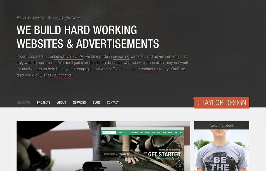
by Gene Crawford | Jul 23, 2012 | Design Firm, Gallery
Really love the parallaxy effect with the background images and the main text/copy on the home page it makes a nice stark difference between the home and sub pages. THe use of different colors for each sub page is nice overall design decision too. The website feels...
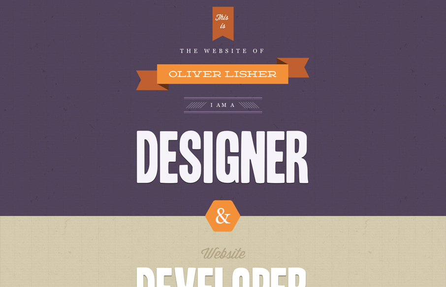
by Gene Crawford | Jul 23, 2012 | Gallery
Very thorough design. Overall the layout is engaging and crisp then the detail work is top-notch. From the interactions on the navigation and logo, the way the main navigation bar fixes itself in place as you scroll down and fades in and out. I also really like how...
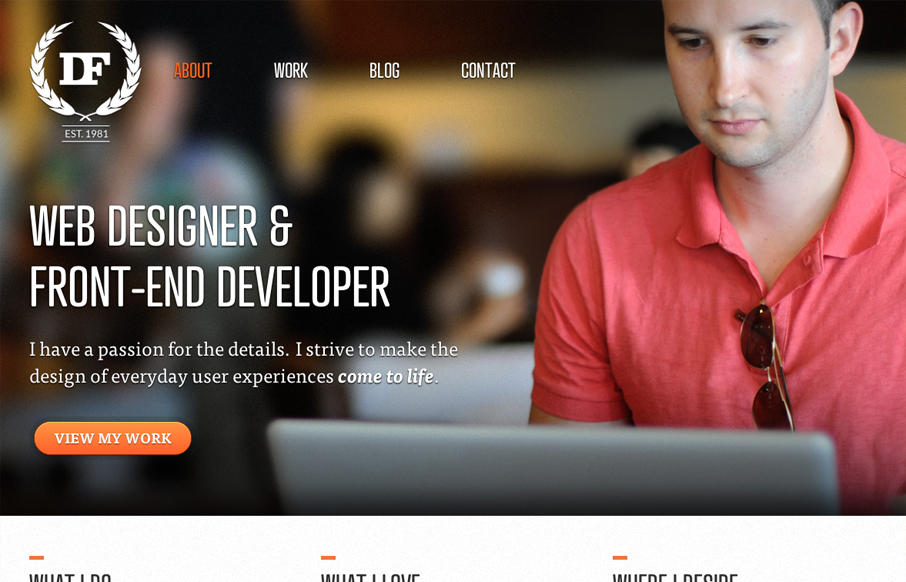
by Gene Crawford | Jul 20, 2012 | Gallery
First off, I want more. This single page is superbly designed visually and I want more pages to look at. There now that’s over. There’s such a nice tactile feel to the design of this website. It’s little detail work like this that pushes something...
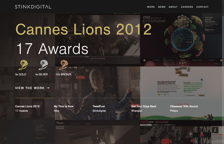
by Gene Crawford | Jul 20, 2012 | Gallery
Nice asymmetrical layout, I really think the larger photo/work shot really helps bring a sense of focus to that section below the gray background/header area. The type is nicely treated visually and there is a solid rhythm as you scroll down the site. I don’t...
by Gene Crawford | Jul 20, 2012 | Non-Breaking Space Show, Podcast
This episode features Samantha Warren (@SamanthaToy) and is hosted by Christopher Schmitt and Dave McFarland. Syndicated from this post. Download MP3 (38.4 MB 00:53:16) Subscribe to the Show iTunes / RSS feed Bio Samantha Warren is an experienced designer, speaker,...