by Gene Crawford | Aug 7, 2012 | Draft, News, Podcast
Play or Download this Episode Download MP3 (17.3 MB / 00:15:39) Subscribe to the Show iTunes / RSS feed About this Episode Responsive Web Design: How has responsive web design changed things for web design shops? About the Show This is Draft, a show about the craft of...
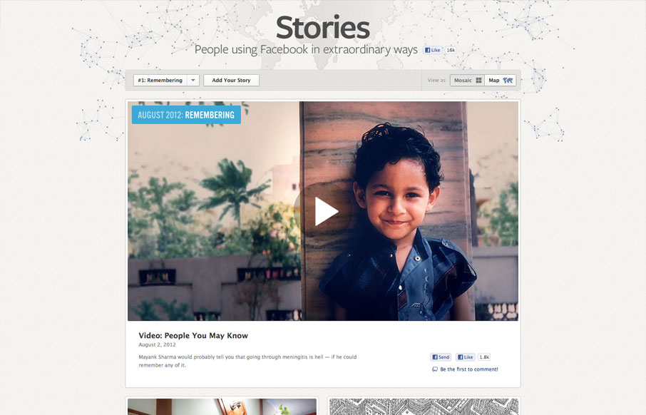
by Gene Crawford | Aug 7, 2012 | Gallery, Marketing
It’s cool to see such great design things coming out of Facebook. Is this what they’ve hired all those designers for? Could be, but I really like it! This design is rather minimal which is perfect for this scenario, the grid is also nice how it goes from...
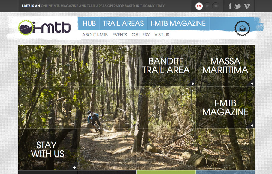
by Gene Crawford | Aug 7, 2012 | Gallery, Sports/Recreation
Submitted by: Andrew Couldwell @andrewcouldwell Role: Designer & Developer I-MTB is an MTB hub for enduro, downhill and cross country bike riders. It’s an online MTB magazine and MTB trail areas operator in Tuscany, Italy. I really like the grid like...
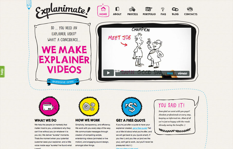
by Gene Crawford | Aug 6, 2012 | Gallery, Marketing
The website is built visually around what these guys do as a service. They illustrate what your product or service does, so they use that same skill on their own stuff. Very fun and open feel. Simple colors and type all work in tandem together like it should....
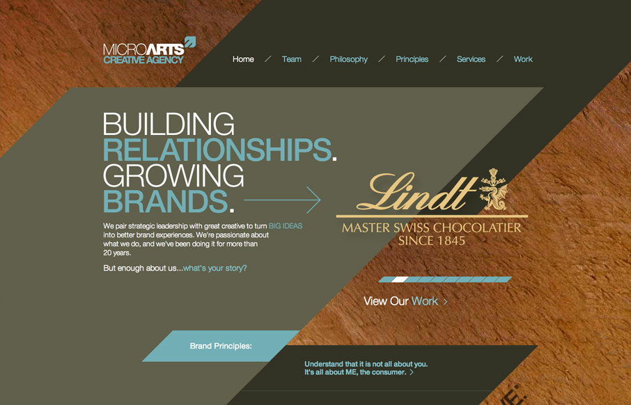
by Gene Crawford | Aug 6, 2012 | Gallery
The diagonals really make this website dynamic visually. The flat shapes of color laid on top of the textured background image also adds to the visual interest to keep you looking. I find the colors a bit muted personally but it still works tone wise when you read the...