by Gene Crawford | Aug 13, 2012 | Gallery
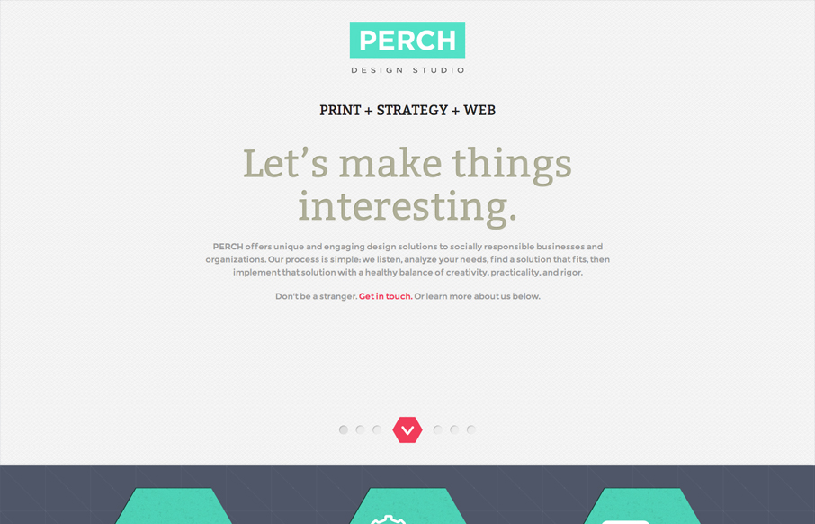
Name: Stacy Kim @perchmade Role: Designer & Developer Although this website is fairly complete—we really consider this a one page splash page—a precursor to the full website. The design is simple and focuses on color and typography. This may be just a one page...
by Gene Crawford | Aug 10, 2012 | Gallery, Travel
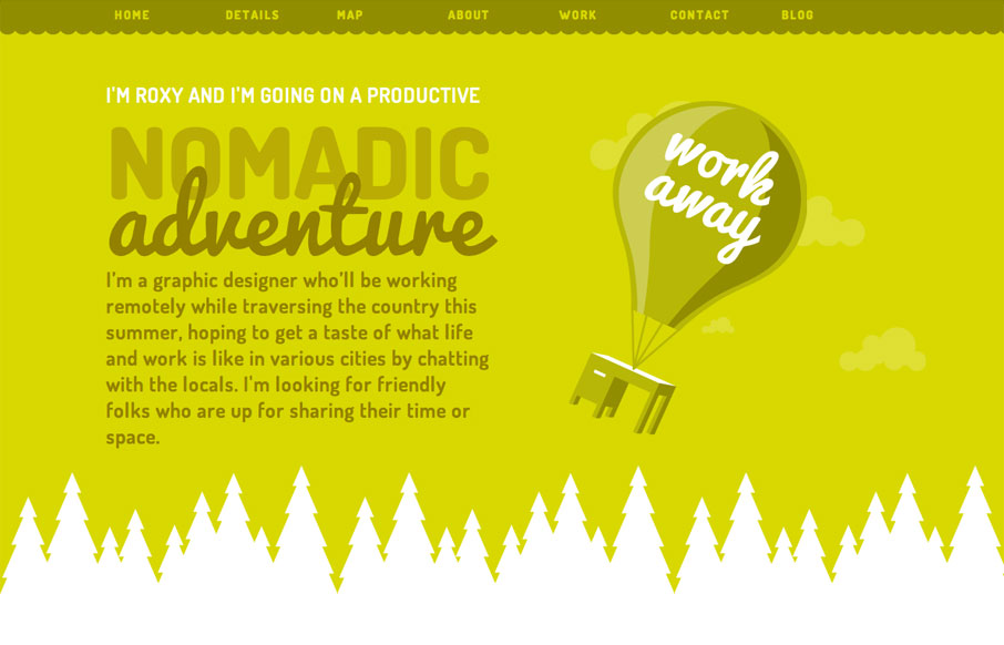
Just a great consistent feel across all elements of this single page website. The illustrations and colors have a really nice feel and it comes off as very welcoming. I like that it is responsive, specifically how the images resize and the choices made there between...
by Gene Crawford | Aug 10, 2012 | Gallery
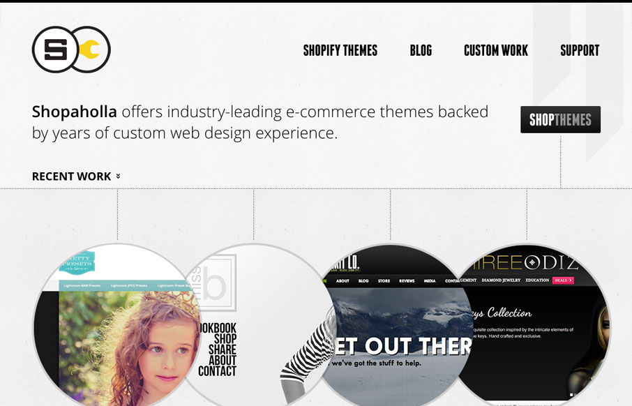
Posted by: Andrew Johnson @and_rwj Role: Designer & Developer This website looks pretty dynamic on first viewing. It has circular shapes were traditional squares would be used, there’s also lots of great little interactions across the page. I especially...
by Gene Crawford | Aug 9, 2012 | Gallery
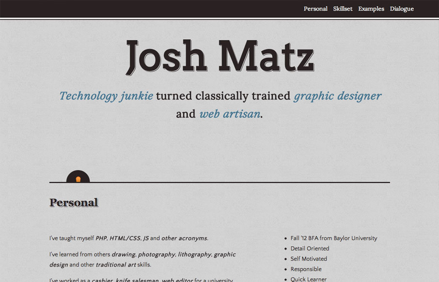
Submitted by: Josh Matz @joshmatz Role: Designer & Developer Overall another fairly simple design but I liked some of the responsive design decisions and I also like the little interactions that have the surprise questions about Josh. That kind of stuff really...

by Gene Crawford | Aug 9, 2012 | Education, Entertainment, Gallery
The way they’ve used the logo in the mint museum website is pretty clever it’s off the side and sort of slanted and it’s not the central element but yet it’s very noticeable. The large hero image slideshow is pretty standard but they’ve...
