by Gene Crawford | Aug 21, 2013 | News
While we’re gearing up for the CSSOff competition here at UMS we came across this event that our friends over at Shopify are doing. It’s not too late to enter either. What is it? A design competition for Shopify partners to find the most beautifully...
by Gene Crawford | Aug 15, 2013 | News
It’s not spring anymore… We know you guys have been waiting for an update for some time now. We’ve seen the tweets and gotten your emails. Between ConvergeSE, Artifact ATX, ConvergeFL, ConvergeRVA and starting up our city’s first Cowork...
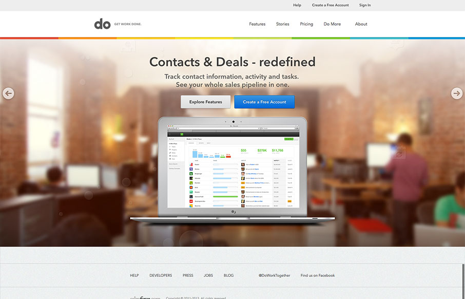
by Gene Crawford | Aug 14, 2013 | Gallery
I really love the simplicity of the Do site design. It’s boiled down to just what’s needed. The overall palette is muted, but not really which is a clever understatement to work into the design. I also dig the Features page, I like how it goes from just...
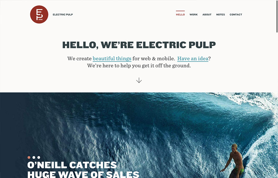
by Gene Crawford | Aug 13, 2013 | Gallery
I’m always a fan of Electric Pulp’s work, their company website designs have always delivered as well. Often being copied outright – which you know what they say about imitation and flattery… This site design follows a trend of simplifying the...

by Gene Crawford | Aug 13, 2013 | Gallery
The new Uber site design is slick and upscale. Nice use of the slideshow IMHO, the images are something out of vogue and adds to the visual branding that they’re rolling with. The site is a stark black and white design with a hint of of the blue/green color used...
