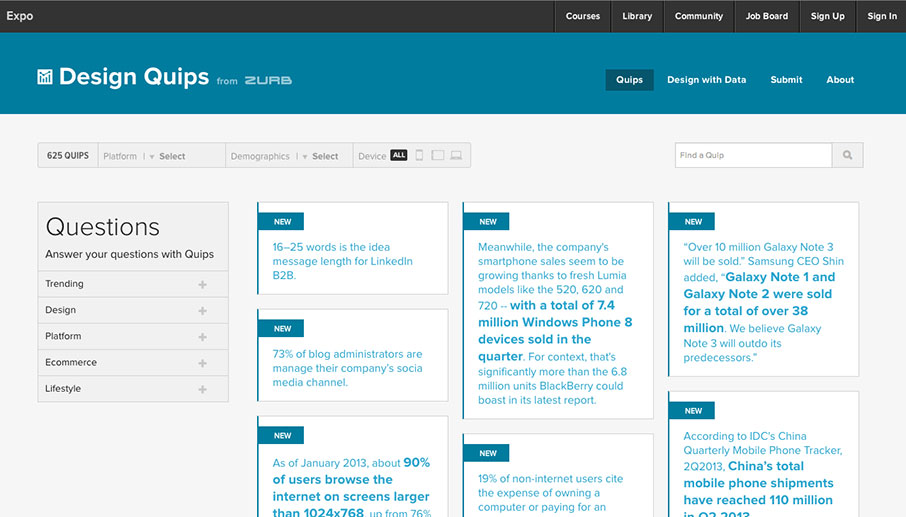
Design Quips is a growing vault of quotable statistics that examines the web from both statistical and human perspectives: How people access the web, what they do online, and how technology evolves.
ZURB, a close-knit team of product designers, created Design Quips to manage individual factoids quoted from online studies and research. Designers, developers, marketers, entrepreneurs and educators can use to defend their design decisions, to make informed design choices, and to understand the web.
Launched this past summer, Design Quips is making headway for designers to use facts about where the mobile market is, make predictions on where it might be going and most importantly validating the work we are all doing.
How Quips has helped them
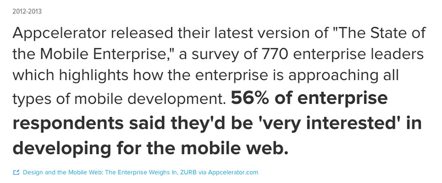
Product designers are not getting trained right and they need tools that allow them to look at problems from an analytical perspective. For example, when it comes to validating a design direction it’s difficult to pull facts quickly for a stakeholder. Now, we can use Quips in our design meetings and work sessions whenever there is uncertainty about a specific piece in the design we are considering implementing. For example, recently one of Zurb’s designers, Brandon used Quips to validate a design decision on whether or not to use social logins. Quips gave Brandon the ability to quickly pull up this cool fact:
Needless to say they added social plugins and the client was stoked.
Because technology is on a direct path towards 100% mobility there are new habit patterns being formed that must be noted and considered for each product that users experience. Quips provides data on user habits and patterns so designers and stakeholders have the ability to review their current products and projects with clarity, implement design decisions about today’s trends, and execute new design ideas based on what is known about the current user’s habits.
What is Quips?
- Design Quips adds quality evidence to support a design direction.
- This tool allows designers to justify their design based on empirical evidence.
- Tool for designers to do better design work with clients.
- A reference and learning tool for product designers at Zurb.
- The Zurb team wanted a resource to reference
- The Zurb team felt it would be useful to other designers.
How Zurb developed Quips
- They made a custom CMS because they wanted to be fast with how data was entered, and scalable for easy growth.
- Built using Rails
- Some quips are written on an iPad then uploaded on the go.
- They average 200 new facts a month, 5 to 10 a day and the record is 30 a day.
The benefit for designers
Factoids about user habits or trends provide a resource from which designers can defend their decisions. But they’re also about making decisions that can be defended.
- Resource for designers to research current trends such as the growth of the mobile frontier, and what mobile devices are accessed most often in the industry — as well as to see a “big picture” of where trends may go based on what trends have passed.
- Help designers make informed decisions.
- With statistics, designers can look at issues from an analytical perspective.
Designers need to validate their work/decisions.
- Give industry context to designers’ decisions.
- Quips gives you another way to provide context to decisions.
What have they learned from making this resource
Zurb built a framework to organize the data they were collecting, knowing that it would likely change as it grew.
- No one else is doing this quite the way they are — specifically for modern online design.
- By 200 quips they had to organize them in order to make the aggregation easier.
- Facts seemed to disappear, so they had to organize it daily rather then just dump the data into the CMS and hope for the best.
- This was surprisingly more complicated than first thought — one-off tags meant little, but tags assigned to 50% of quips didn’t help. Surprises came when they cross-referenced topics, like “mobile” and “adult”, or “ecommerce” and “decline”.
- A few tags were more than topics: “growth,” “decline” describe trends. “Infographic” and “PDF” describes the source’s type.
- They discovered that reliable, accessible sources were vital. One time they re-checked some facts in an article, and discovered the article had dead links. Decided that was unacceptable — then axed the quips from the system. It set a bar for quality.
- Ensuring the data is quality is also not easy either because every source must be checked for authenticity
Examples of interesting facts about the mobile first approach
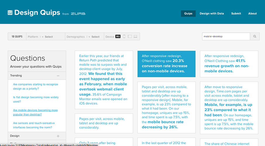
Still learning the best way to organize and use the data. By recently organizing quips into question, not topic or keyword. For example:
Why Zurb will be implementing Quips more often into their design presentation
- Ensure that the direction of design is based on measurable evidence not guessing
- Ensure that the designs created last because they are thinking ahead of the market
- Ensure that they use actual data not just browse sites to validate a design idea
- Give their designers the ability to grow and use tools that will improve the design process and ultimately improve the design
- Stakeholders will have more security in their investment of a designer who uses tools like Quips and looks at a design from an analytical standpoint
Design Quips grows with each new fact added. It’s exciting to see what Quips will look like as it grows in years to come — and how people use it to validate their work, make informed decisions, or discover how amazing and varied a place the web is.


really?))) don’t know that before) thank u)