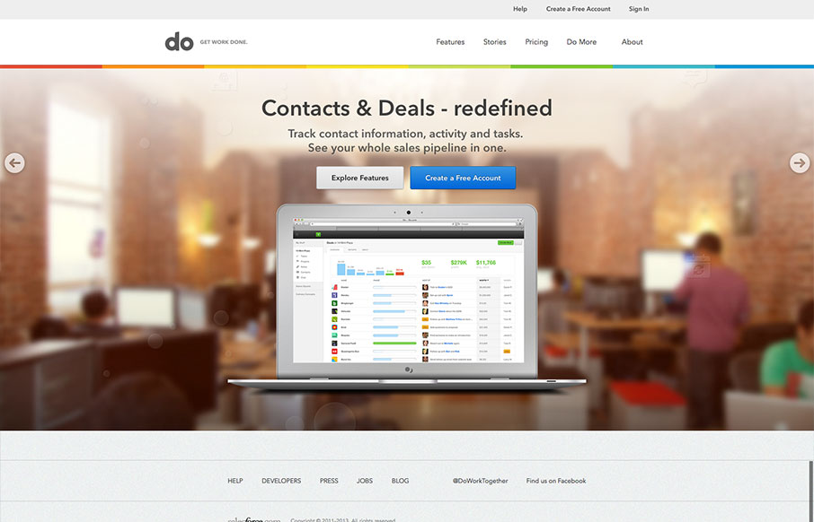
by Gene Crawford | Aug 14, 2013 | Gallery
I really love the simplicity of the Do site design. It’s boiled down to just what’s needed. The overall palette is muted, but not really which is a clever understatement to work into the design. I also dig the Features page, I like how it goes from just...
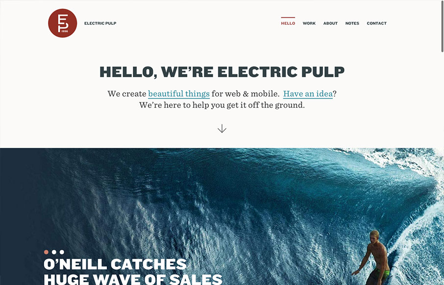
by Gene Crawford | Aug 13, 2013 | Gallery
I’m always a fan of Electric Pulp’s work, their company website designs have always delivered as well. Often being copied outright – which you know what they say about imitation and flattery… This site design follows a trend of simplifying the...

by Gene Crawford | Aug 13, 2013 | Gallery
The new Uber site design is slick and upscale. Nice use of the slideshow IMHO, the images are something out of vogue and adds to the visual branding that they’re rolling with. The site is a stark black and white design with a hint of of the blue/green color used...
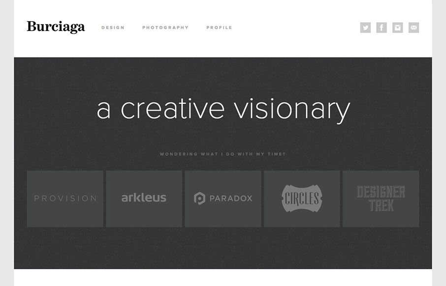
by Gene Crawford | Aug 12, 2013 | Gallery
Super sleek and fairly minimal the Burciaga website looks great. I really like how it starts off primarily muted in colors with the grays, then as you interact with it and scroll you get colors. The design is primarily made up of the examples of work samples which is...
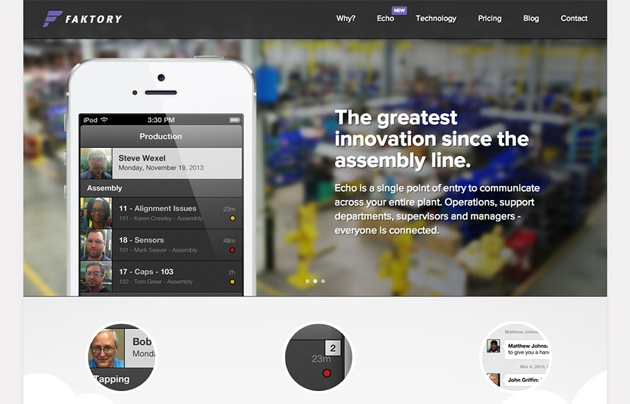
by Gene Crawford | Aug 12, 2013 | Gallery
I really dig the smooth nature of this layout. It looks visually complete as you scroll down and/or click through different sections of the page. I do think it lacks in content, for example I want more on the pricing section. I get that they need to consult with you a...