
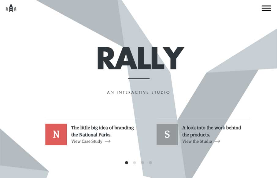
I love just about everything there is about the Rally website. The main “hero” area, not sure what to call this area anymore really, is super dope. The “ribbon” graphic is very nicely executed, even when you scale the screen down the ribbon stays relevant. I love how the section to section transitions work both technically and content organization wise. Such a smart fresh site.


Fitts’s Law: Why the Easy Button Wins
Large, close targets are faster to hit than small, distant ones, that’s Fitts’s Law. A look at the 1954 rule behind buttons, prime and magic pixels, thumb zones, and dark patterns.


0 Comments