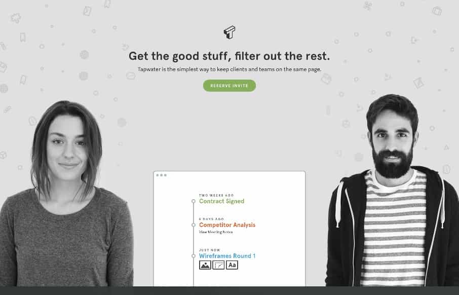
I like the way this site layout feels almost like a new conceptual approach, much like the app seems to be. I dig the meta-ness of this. I like a lot about how they’ve managed the design across screen widths, and if you scale the page down in your browser the way the headshots shift in size is quite nice too.


0 Comments