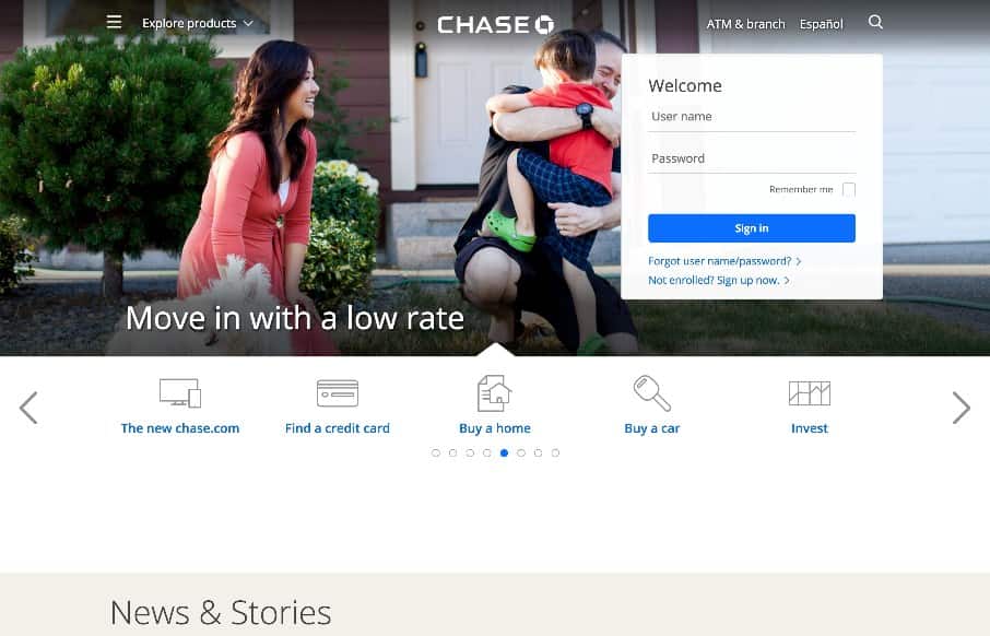
A fairly clean experience for a big credit card website. The Chase site is responsive and has some nice open space throughout that really helps with the large amount of “stuff” they’ve put on the screen. I like the navigation design, using the hamburger icon and “explore products” together is the best of both worlds. Good stuff here.


The Call to Action, Revisited
The Call to Action hasn’t changed in a decade, but the bar has. A fresh look at prominence, copy, mobile tap targets, and accessibility, with lessons from three major design systems.


0 Comments