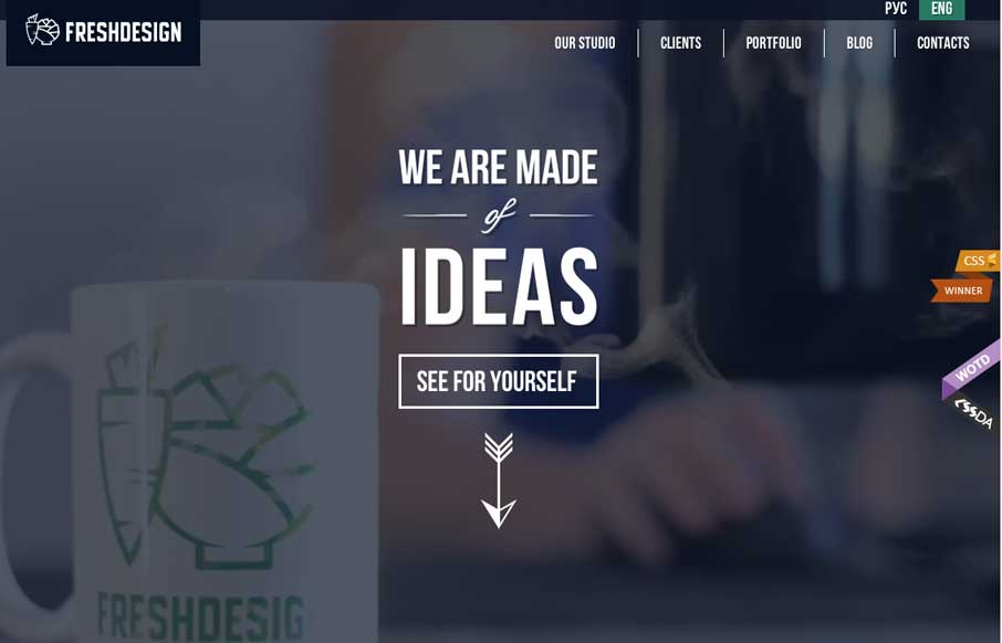
by Aaron Griswold | Jul 14, 2014 | Gallery
There is so much going on in this site (which is a good thing in this case) – from video background, to animated infographics, to maps with carrots growing out of them – you get the idea that this agency has enough skill to make your website pretty darn...
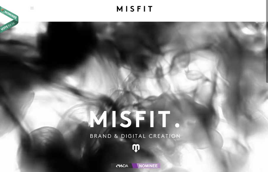
by Aaron Griswold | Jul 11, 2014 | Gallery
I almost don’t have to write a review on this one – Pete Brady (below) really captures the site – black and white with the color coming from the work Misfit does. He forgot to mention the thing that draws you to the site in the first place –...
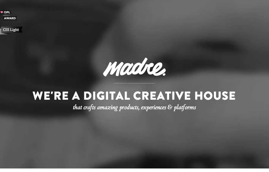
by Aaron Griswold | Jul 10, 2014 | Gallery
Let’s start Thursday with a good one – Madre Crossmedia. It’s very simple, but has some different interactions than most agency sites. The copy and the form are subtly animated as it comes in on scrolling. The links to the portfolio give you a hint...
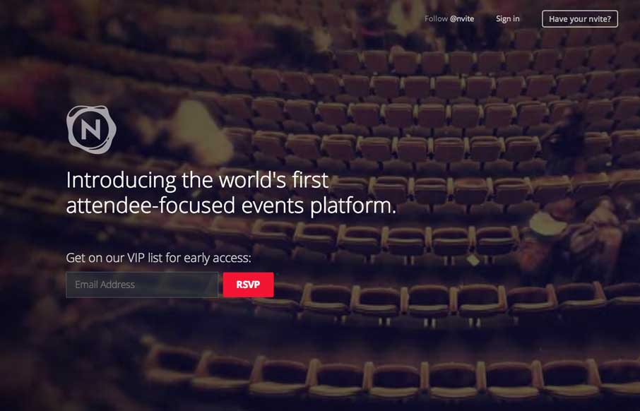
by Aaron Griswold | Jul 9, 2014 | Gallery
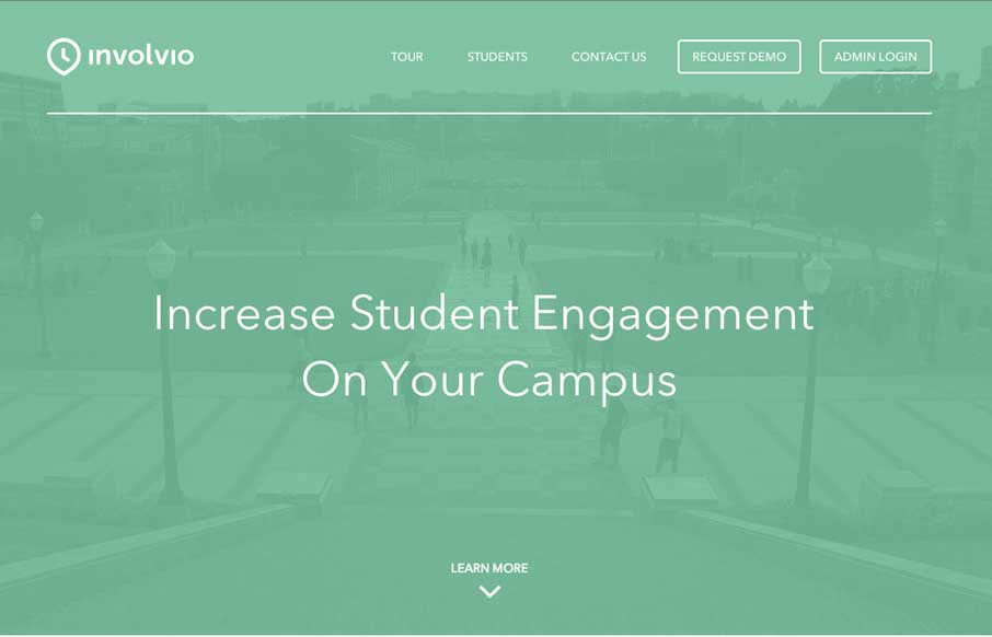
We put on a lot of events throughout the year, whether through Unmatchedstyle, with our Converge, BDConf and other conference series – or here locally in the co-work we started last year – so we’re always interested in new event management apps /...
by Aaron Griswold | Jul 3, 2014 | Gallery
Involvio has a pretty cool little site. As we see video backgrounds come into play, they are either overt or muted – and I keep thinking that the muted, with added text, plays better to market your website. The rest of the site is clean, with good app-selling...