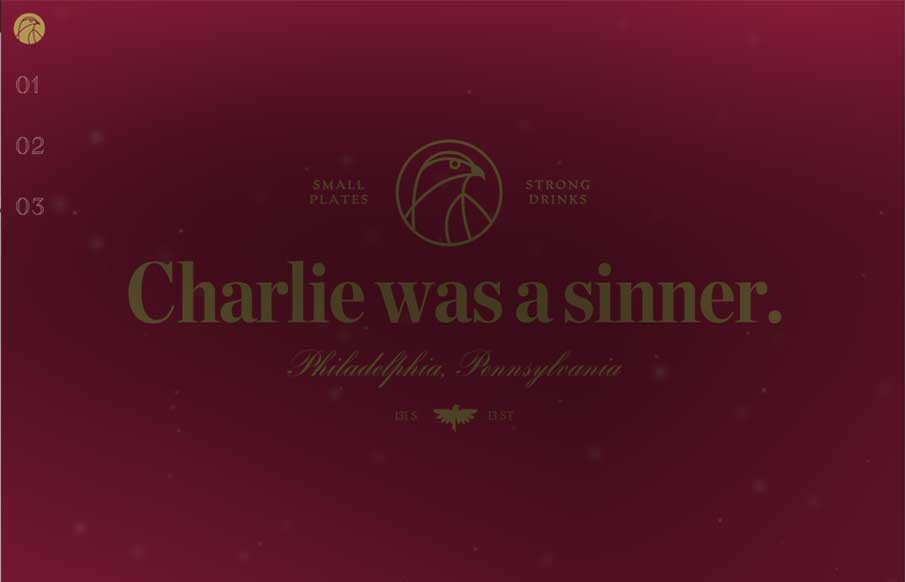
by Aaron Griswold | Feb 12, 2015 | Food and Beverage, Gallery
It took me a minute, and still don’t know who Charlie is (they don’t talk about Charlie) – but if I’m in Philadelphia (maybe this summer), I’m going to check out this vegan restaurant, that boast of “small plates and strong...

by Gene Crawford | Feb 10, 2015 | Gallery
There are some really cool pieces/parts to this design. I like the graphic way they tell the specific pieces of the story about their company. I also like the pattern used over the images.
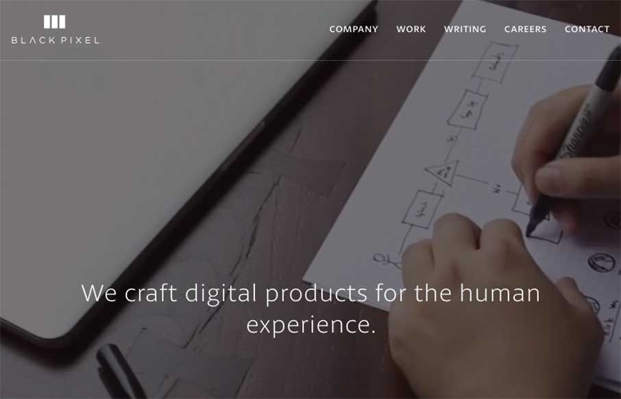
by Aaron Griswold | Feb 6, 2015 | Gallery
I have a new weather app because of the Black Pixel agency out of Seattle, Washington (The Funny or Die Weather app from Will Ferrell’s company). Black Pixel did the redesign. They also redesigned their website, which is pretty awesome, design-wise, and every...
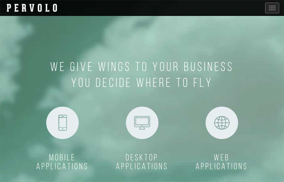
by Gene Crawford | Feb 3, 2015 | Gallery
I like the monochromatic approach to the color and the simple line art icons give it a good vibe. I also like the way the header is treated visually as you scroll down a bit.
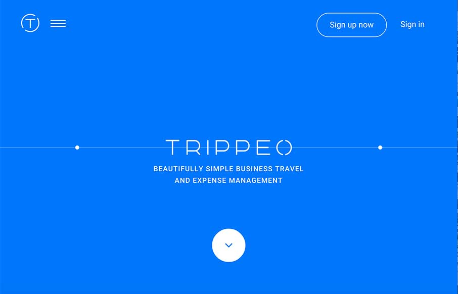
by Aaron Griswold | Jan 29, 2015 | Gallery, Travel
We reviewed the Trippeo site last year, pre-launch, and remembered it was pretty cool. So we’re looking at it again today – even better. The SVG animation that’s integrated with the video backgrounds and content areas give you a good idea of what the...