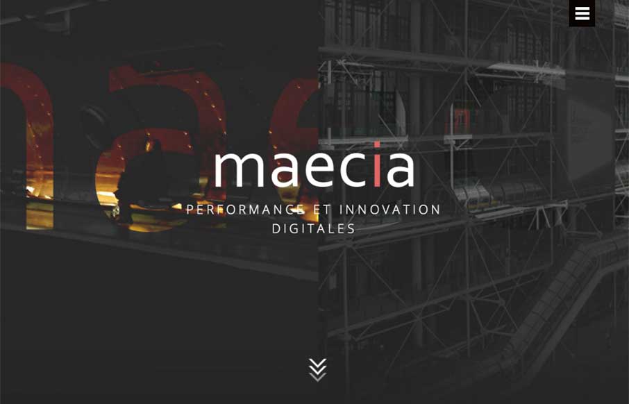
Go ahead – click the hamburger icon… didn’t expect that did you? Maecia, out of Paris has a great site that combines old and new, from the 1800’s industrial line art to the animated svgs and video backgrounds and motion when you’re not expecting it. The menu coming from the hamburger is a good parallel to the trend of using the home page as navigation (and mouse over the middle Maecia / Welcome button for some added video background). Also like the little call to action banners at the bottom of the pages – totally useful, and fit in perfectly with the design.
Glassmorphism: The Transparent Design Trend That Refuses to Fade
Glassmorphism brings transparency, depth, and light back into modern UI. Learn how this “frosted glass” design trend enhances hierarchy, focus, and atmosphere, plus how to implement it in CSS responsibly.


0 Comments