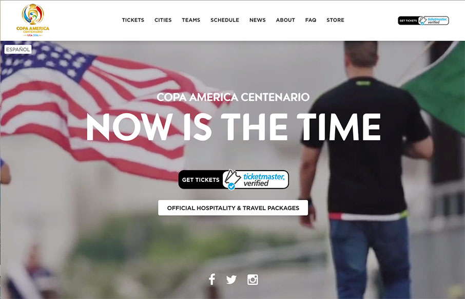
by Aaron Griswold | Jun 2, 2016 | Gallery, Sports/Recreation
I. Love. This. Site. for Copa America (that starts this Friday night in the US) – and not just because I’m a soccer (football to our friends across the pond) fan. It’s simply one of the best sports sites I’ve seen – and the mobile...
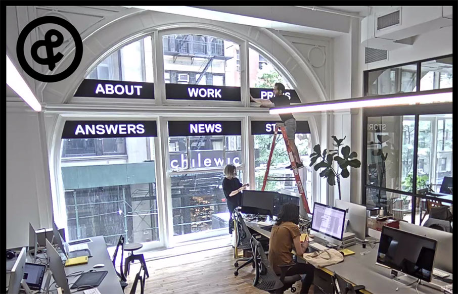
by Gene Crawford | May 31, 2016 | Design Firm, Gallery
Website for the legendary Sagmeister design studio. Pretty interesting, but the most intriguing part is that the home page is a live feed from their office. So weird, and so cool.

by Gene Crawford | May 24, 2016 | Gallery
Whew. I loved making my way all the way to the bottom of this home page. The way the copy plays with the headlines and sections is brilliant. I love it. I also really dig the overall design. Colors, layout, etc… for each section, it changes up enough to show...
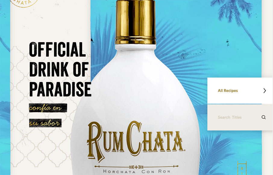
by Gene Crawford | May 18, 2016 | Food and Beverage, Gallery
Some really crazy parallax and interactions on the Rumchata website to get you going.

by Gene Crawford | May 17, 2016 | Design Firm, Gallery
What a badass website. It’s really the approach to the brand that drives this site design. From the animated background flag to each illustration and placement of content this website makes me happy. Bravo.