
by Gene Crawford | Sep 24, 2014 | Gallery
Here’s a good example of a site pretty much hiding everything except a few links to case studies/work examples under a fly out overlay nav. I gotta assume this is by design. I do like the idea of keeping most people focused on your work like this btw.
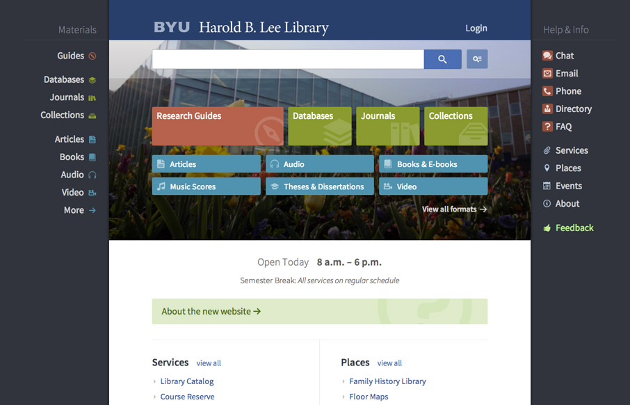
by Gene Crawford | Sep 22, 2014 | Education, Gallery
Very interesting user experience design going on. I really dig the fixed side menus a lot. Very smart interactions. Wow. Just wow. New website for @BYU Libraries: http://t.co/xxO000oA9E Soon to be the envy of all #libweb types. Nice work, @HBLL— Erin White...
by Gene Crawford | Sep 22, 2014 | Gallery
I like how the website feels like it slides into place over the big header “hero” image area, then looks like a standard style left column nav based design. That’s a cool effect that’s really just about positioning the page elements...
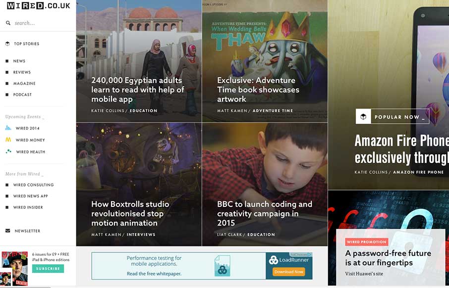
by Aaron Griswold | Sep 9, 2014 | Entertainment, Gallery
Man… usually infinite scroll on most sites isn’t so infinite… I still haven’t gotten to the end of Wired UK’s collection of cool photos and stories on this vertical infinite scroll… still going… nope… Obviously the...

by Gene Crawford | Aug 20, 2014 | Gallery
What a unique design for this salon. I feel like it’s really something different for what most people experience with their salon’s website. It’s subtle and very smooth feeling as you go through it to me.