by Aaron Griswold | Oct 1, 2015 | Gallery
Really great editorial website layout. I love how the text flows between the images and the white space – and really love the rest of the text work on the other pages – it’s not totally bound to a grid.
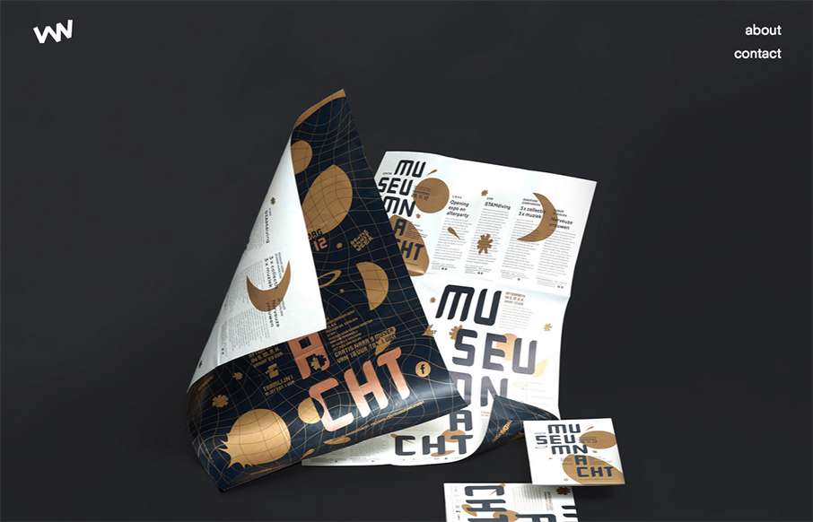
by Gene Crawford | Oct 1, 2015 | Design Firm, Gallery
Really simple layout, it’s like one project at a time to check out then only 2 other simple nav items. I love this approach. I don’t like the bottom “read more” link, I’d like it to be more obvious across all images used for this section....
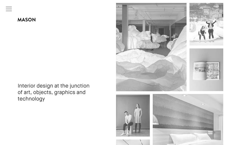
by Gene Crawford | Sep 30, 2015 | Gallery
Really cool minimal approach to the interior design studio Mason’s website. I dig that you basically only check out some images then there’s the hamburger menu, because they take you to some good sample pages of the company’s work. Simple flow of...

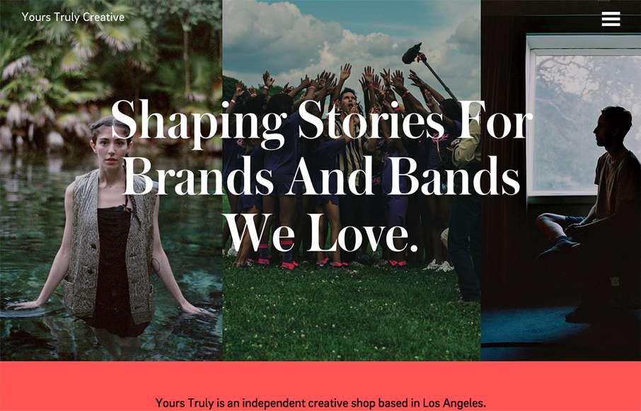
by Gene Crawford | Sep 23, 2015 | Gallery, Marketing
Nice work with this heavy grid layout, lots of sections of content to get on the page. Sometimes, boy do I know, it’s hard to work with all sorts of content that a client might give you and this design just screams this to me. I really like how it’s all...

by Gene Crawford | Sep 22, 2015 | Community / Social Networking, Gallery
Really nice and clean layout for the Atlanta Tech Village website. I like the way they are showing you people in the space, with photos and video background, etc… the home page keeps you streamlined and puts what people would want to know most up front. This...