by Gene Crawford | Oct 22, 2014 | Gallery, Medical
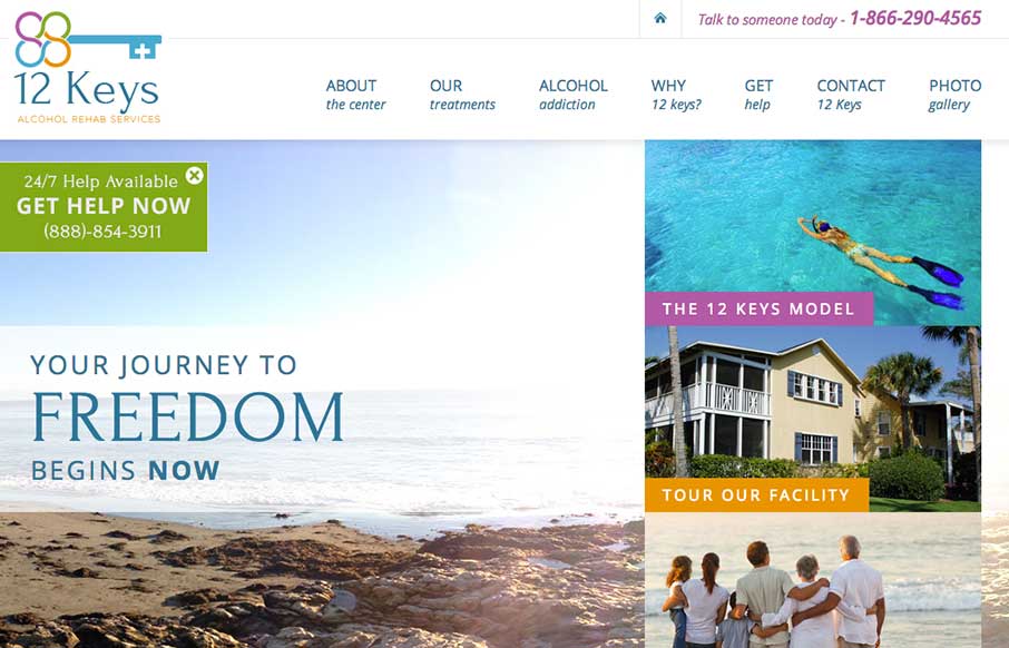
There’s a lot going on on visually with this page, lots of content and sections. The overlay with the help line number is good and smartly placed. I do wish the page was responsive too. 12 Keys Alcohol Rehab Services provides a retreat for those suffering from...
by Gene Crawford | Oct 21, 2014 | Design Firm, Gallery
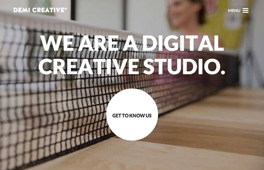
Big bold visual style for Demi Creative. I dig it. I like the simplicity implied into the site design, the main link is the “get to know us” call to action and it draws you in. The nav under the hamburger icon feels slightly lost but once you dig into the...
by Gene Crawford | Sep 30, 2014 | Gallery
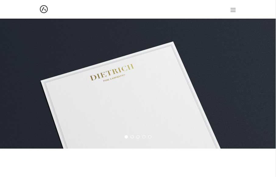
Very nice, clean and precise display of work and design expertise. Keep it sharp and keep it concise and you’re golden, just like Seth Addison. Submitted by: Seth Addison @sethaddison Role: Designer Seth Addison is a brand and identity designer with a focus on...
by Gene Crawford | Sep 22, 2014 | Education, Gallery
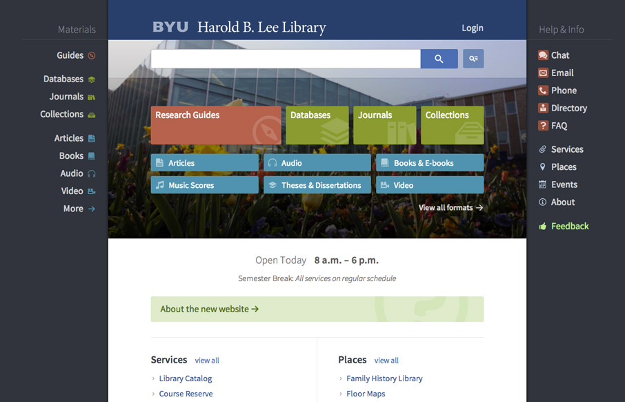
Very interesting user experience design going on. I really dig the fixed side menus a lot. Very smart interactions. Wow. Just wow. New website for @BYU Libraries: http://t.co/xxO000oA9E Soon to be the envy of all #libweb types. Nice work, @HBLL— Erin White...
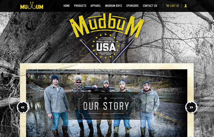
by Gene Crawford | Sep 22, 2014 | Gallery, Sports/Recreation
Interesting content with a good looking strong design to boost it up. I love how it tells their story so well and sets the tone with the visual brand at the same time. Makes me want to get out on the lake and catch some catfish man.