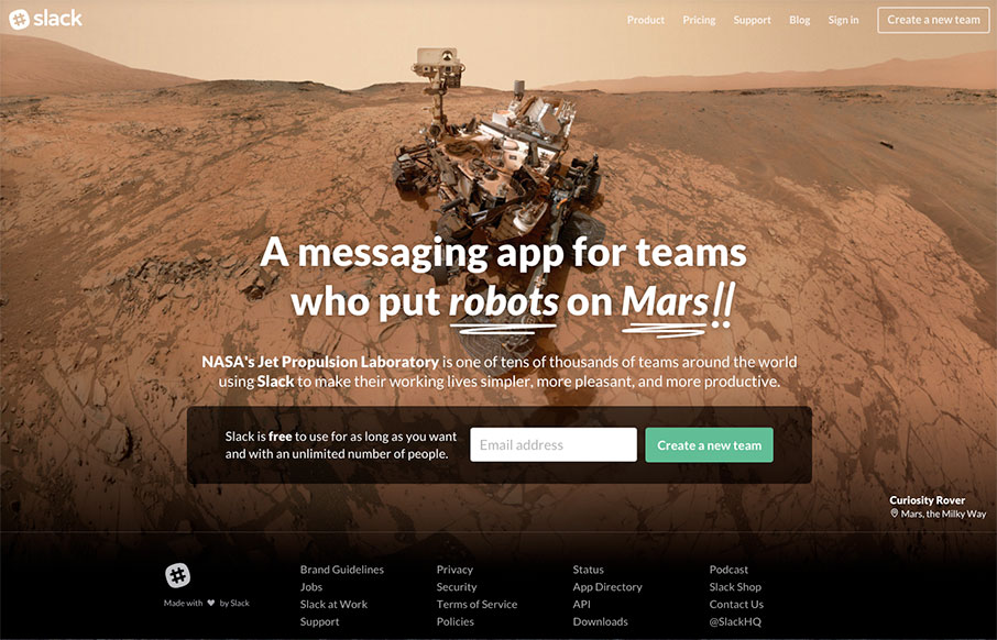
by Aaron Griswold | Feb 1, 2016 | Gallery
Be sure to refresh a few times – very cool images and typography – but we like Slack’s site because it cuts to the chase – the one thing they want you to do here is “Create a New Team” – CTA is key – looking good is...
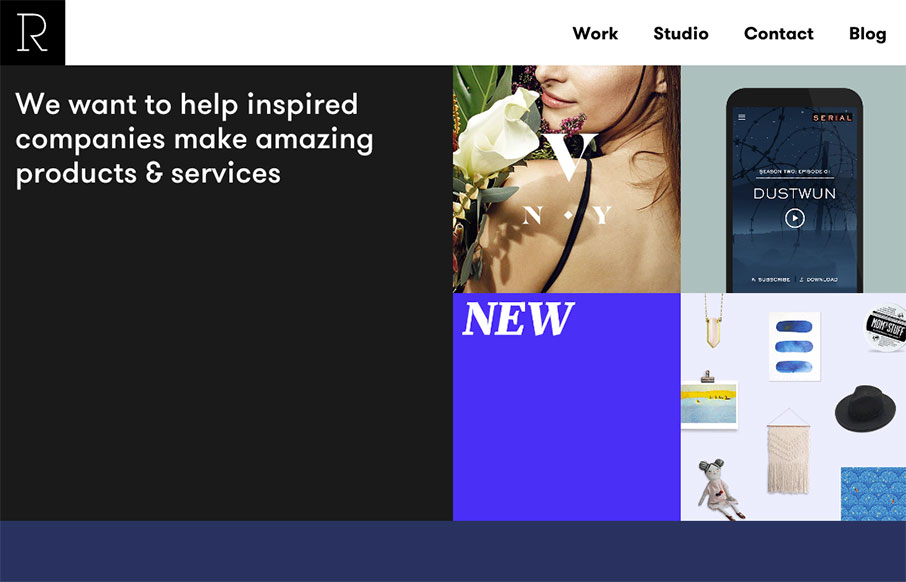
by Gene Crawford | Jan 28, 2016 | Gallery
Pretty slick looking layout for Studio Rodrigo. I really like the big open areas matched up with smaller product images in a small grid like it has. Pretty solid design as you scroll down the home page too. Love this site.
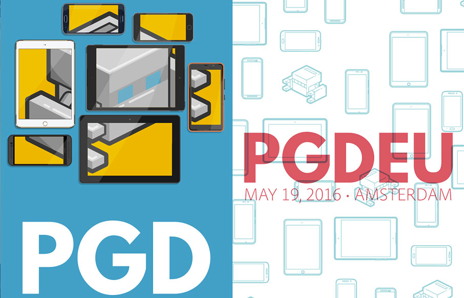
by Gene Crawford | Jan 25, 2016 | Conference, Gallery
Really solid yet simple conference website layout. I really like the big header area with the mobile device illustrations that scroll through/over the PG logo. Then I notice that the entire page scrolls over the logo. Neato! There’s clearly some love and care...

by Aaron Griswold | Jan 21, 2016 | Gallery
Well – we already love the design of the Uber app – so it goes to say that their website is just as well designed. Love the sleekness of the whole site – and UX-wise, very easy to get around and get what you need.
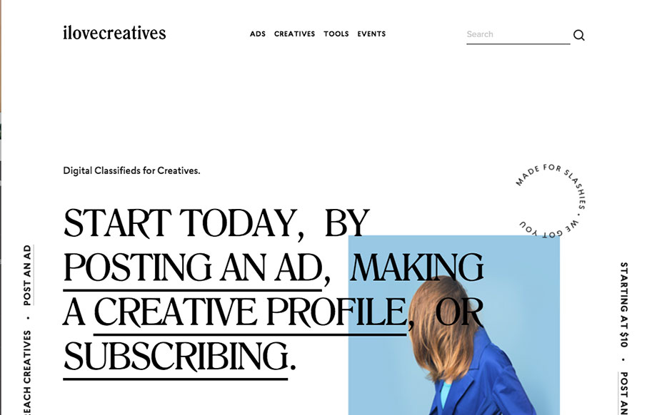
by Gene Crawford | Jan 20, 2016 | Gallery
I’m not sure about the service but the design is pretty legit. I like that it’s largely text based in the layout and there are some nifty design details as a result. The slight parallax on the text and image is quite nice and well placed. I also really dig...