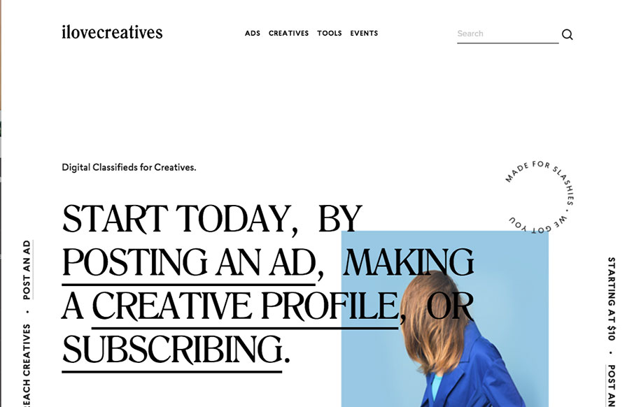
I’m not sure about the service but the design is pretty legit. I like that it’s largely text based in the layout and there are some nifty design details as a result. The slight parallax on the text and image is quite nice and well placed. I also really dig the placement of the submit button next to the newsletter signup field.


The Call to Action, Revisited
The Call to Action hasn’t changed in a decade, but the bar has. A fresh look at prominence, copy, mobile tap targets, and accessibility, with lessons from three major design systems.


0 Comments