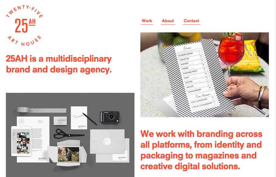
by Gene Crawford | Feb 24, 2015 | Design Firm, Gallery
The 25 Art House website has a really cool vibe with the clean and crisp typography and the large notecard looking case study link blocks. I dig the ‘masonry’ loading and sliding around the link blocks do as well on screen resize. Cool site.
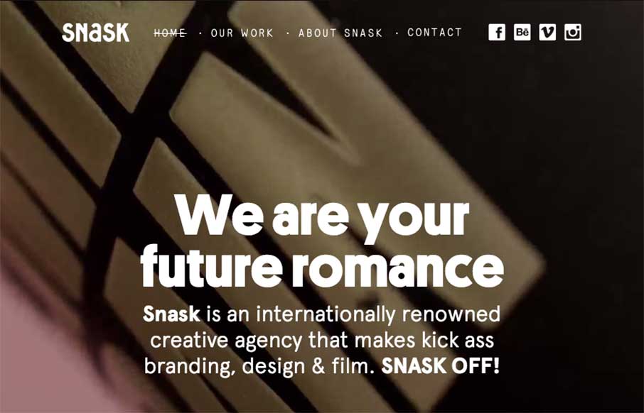
by Gene Crawford | Jan 7, 2015 | Gallery, Marketing Company
Some fairly straightforward design queues here on the Snask site. But I really really love the way the images are placed on the page. They just feel like they’re embedded in the page somehow to me. Kinda like a nice offset printed page feels. Know what I mean?...
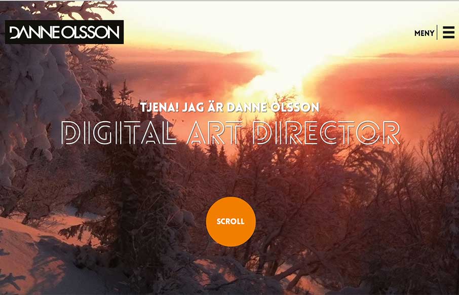
by Gene Crawford | Nov 20, 2014 | Gallery, Portfolio
Really like the photography and typography on this portfolio website. It’s smooth feeling to me as I scroll with it. Also, you gotta dig the loch ness monster on the contact page there.
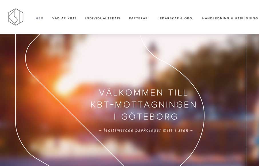
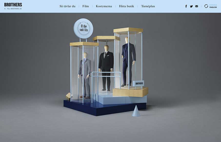
by Gene Crawford | Oct 16, 2014 | Gallery
What a great visual mark; the KBT logo. I’m probably biased, since I love everything Swedish. But man it’s hot. I love the light feel to the design and the colors throughout. I do wish it was responsive, but it’s hard to tell sometimes how old a site...
by Gene Crawford | Sep 16, 2014 | Gallery
Fun layout and sometimes weird details make this page pretty fantastic to me. Enjoy.