by Matt Keogh | Feb 11, 2015 | Food and Beverage, Gallery
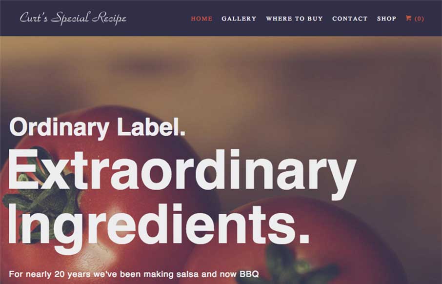
This site is all about the tone for me. Big bold text on the home page set in a simple none fancy sans-serif font. Bold, earthy, homely imagery – love whatever filter they’ve used on these. The design could have easily gone down a more handcrafted/organic/market...