
by Gene Crawford | Jan 28, 2014 | Gallery, Shopping
The Jewelry Wise website is a great example to study if you’re considering one of those mega-navs. This design utilizes it quite well on both the desktop and mobile versions of the design. The page also has good rhythm and leads you down the page in a succinct...

by Gene Crawford | Jan 6, 2014 | Design Firm, Gallery
The new Adaptive Path website is “as always” a thing of beauty. There really is a lot going on here when on the surface it looks like a simple design. From the slight movement of the top header/navigation, to show you it’s there, down to the overall...

by Gene Crawford | Dec 9, 2013 | Gallery, Screencast Review
The new Google Ventures site is an interesting study in creating something rich and minimal. Rich in that there are a number of visual and interactive features that make the site interesting and extremely navigable. I’m not a huge fan of the side-based fly out...
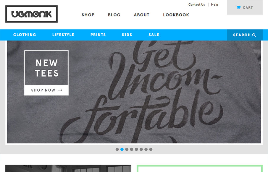
by Gene Crawford | Dec 3, 2013 | Gallery, Shopping
The newly updated Ugmonk store site is very clean and straightforward, enabling the user to very easily look through their products. I particularly like the header nav design. The way the store nav is “featured” by sticking in place as you scroll down the...
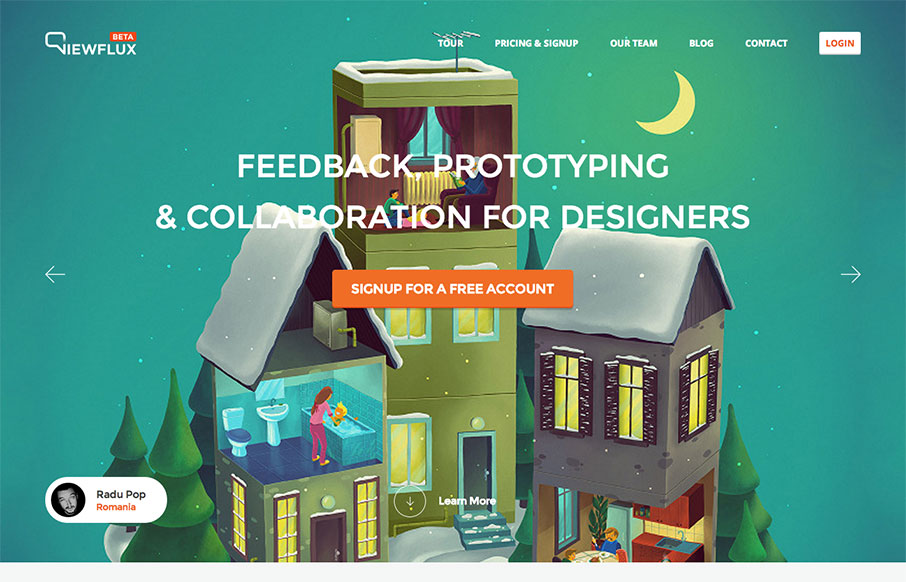
by Gene Crawford | Dec 2, 2013 | Gallery
I like the implied simplicity of the viewflux site design. It starts off with large photos in a slideshow which seem noisy visually but then it tapers off into some really nicely done grid layout and easy to read copy design. I particularly dig the way the tour page...