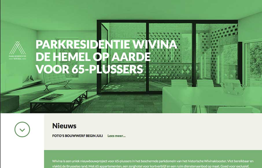
by Gene Crawford | Sep 22, 2014 | Gallery
I like how the website feels like it slides into place over the big header “hero” image area, then looks like a standard style left column nav based design. That’s a cool effect that’s really just about positioning the page elements...

by Gene Crawford | Sep 17, 2014 | Gallery
I dig the look of this design. It’s flat and clean and really feels like a engineering company to me. Only wish it was responsive, but otherwise a really smart looking layout. Steve Semanchik @vitaminisgood Role: Designer The Kibart home page showcases the...

by Gene Crawford | Sep 12, 2014 | Gallery
Pretty cool feel to this site. I like the colors and the blocky approach to the layout visually. Pretty fast movement and interaction speeds as well which lead to it feeling faster overall to use.
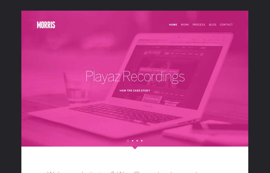
by Gene Crawford | Aug 26, 2014 | Design Firm, Gallery
Cool vibe to this site design for Morris. I like the colors and they way the elements are presented. It feels kind of fresh and has that “mobile” vibe to it visually. Pretty neat.
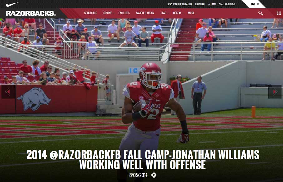
by Aaron Griswold | Aug 6, 2014 | Gallery, Sports/Recreation
Football (Gridiron) season is in a couple of weeks. Even though this isn’t my favorite team, really like their website. The large images and videos give it a bold and loud feeling, that translates really well if you’re a fan.