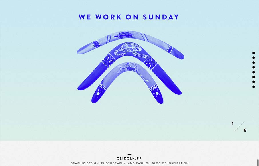
by Gene Crawford | Sep 19, 2012 | Gallery
Fun website! I like the duotone color look as well as the way the scrolling is designed. Also cool way to display the work, in the monitors like that, it’s not new to see but in this instance it feels fresh somehow – maybe it’s the boomerangs?

by Gene Crawford | Sep 18, 2012 | Gallery, Marketing
Via: Bob Galmarini on Dribbble Really fun little microsite / landing page for the Pantech Flex went live today. Check out the screen swap to show off the different phone UI. What a great website design. It’s just a single pager or microsite as they’re...
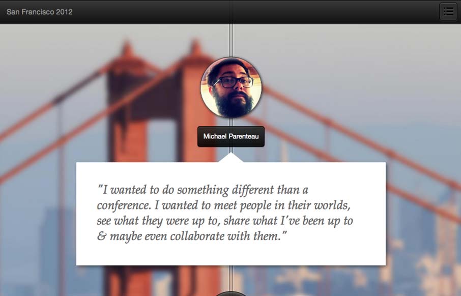
by Gene Crawford | Sep 17, 2012 | Gallery
This is a tale of a Designer/Developer that went on a trip to meet people in the product space in San Francisco. The plan was simple: take some conference budget and get creative with it. When it is all said and done.. make a small mini-website and tell a story....
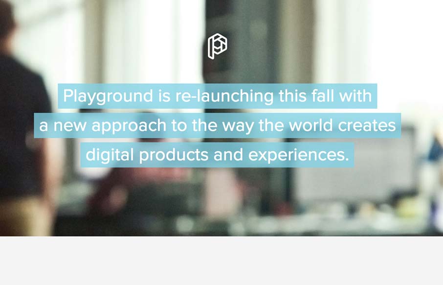
by Giovanni DiFeterici | Sep 13, 2012 | Gallery
This is how you should post job openings. This is a lovely little site to entice people of the ‘web nerd’ persuasion. I think that the photo animation is a bit much and seems a little out of place in an otherwise tight and professional design, but...
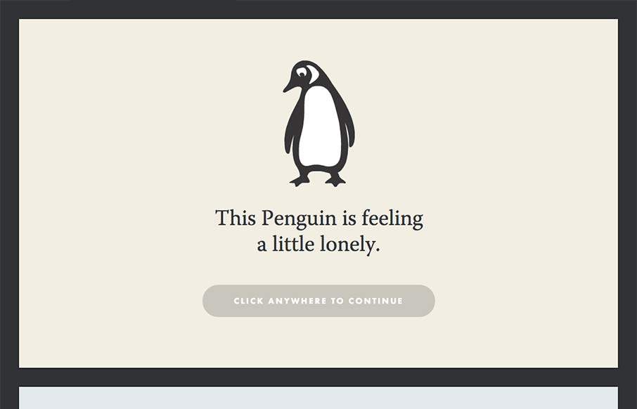
by Giovanni DiFeterici | Sep 12, 2012 | Gallery
Yet another great site intended to attract new talent. I talk a lot about narrative and this site takes that idea to heart. People respond to stories and what better company to seek out those people? Just click through it, its great. Who can’t empathize with a...