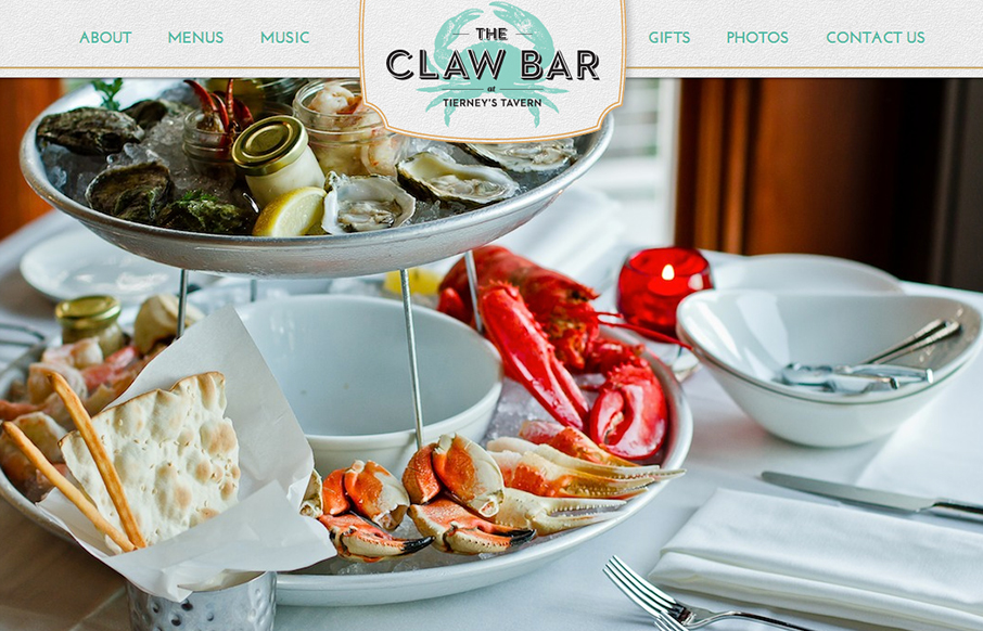
by Gene Crawford | Oct 2, 2012 | Food and Beverage, Gallery
Nice touch with the fixed header and footer, it makes the site really feel like a menu. Wonderful example of a restaurant website, if only it were responsive it’d be perfect IMHO. But it’s pretty damn close now…
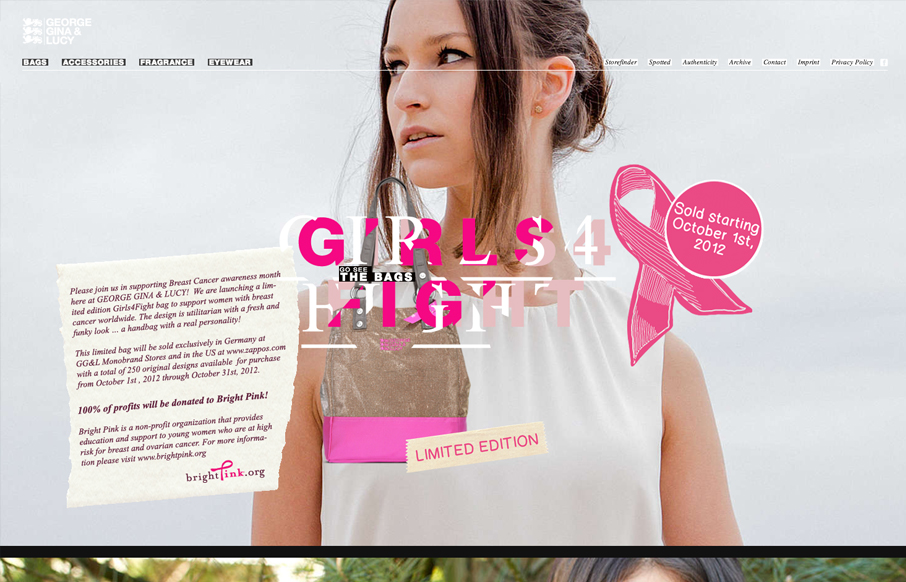
by Gene Crawford | Oct 2, 2012 | Gallery
It’s definitely the year of scrolling/parallax designs. This one is quite nice. The crazy type effect reminds me so much of something David Carson would do. It feels fun and free yet ordered.
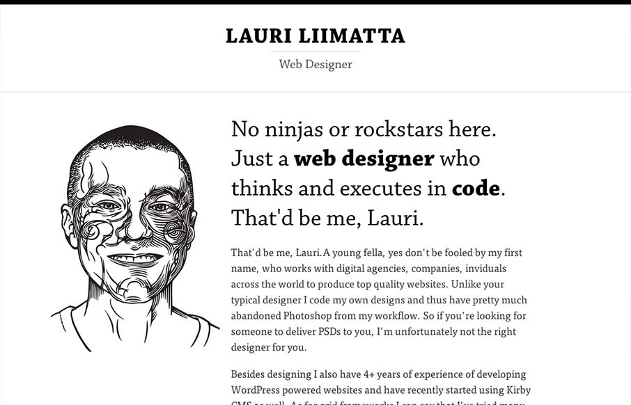
by Gene Crawford | Sep 26, 2012 | Gallery
Submitted by: Lauri Liimatta @laurilii Role: Designer & Developer My new redesigned portfolio. Responsive design and powered by Kirby CMS. I like the design approach of going light to dark from top to bottom, or light to dense visually. However you want to look...
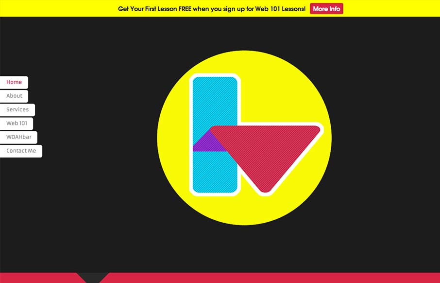
by Gene Crawford | Sep 25, 2012 | Gallery
Interesting single pager. Chock full of bright colors and solid looking illustrations/icons. I like the fixed nav on the left, it’s a nav design i’ve seen before but it just looks like it fits here better than others. There are some sections where the...
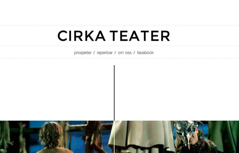
by Gene Crawford | Sep 24, 2012 | Entertainment, Gallery
Cool vibe to this scroller website. I really dig how there’s a slight parallax thing going on with the show sections/images, it really helps give it some depth interaction wise. The flip over effect on the lightbox windows for the show details is unexpected yet...