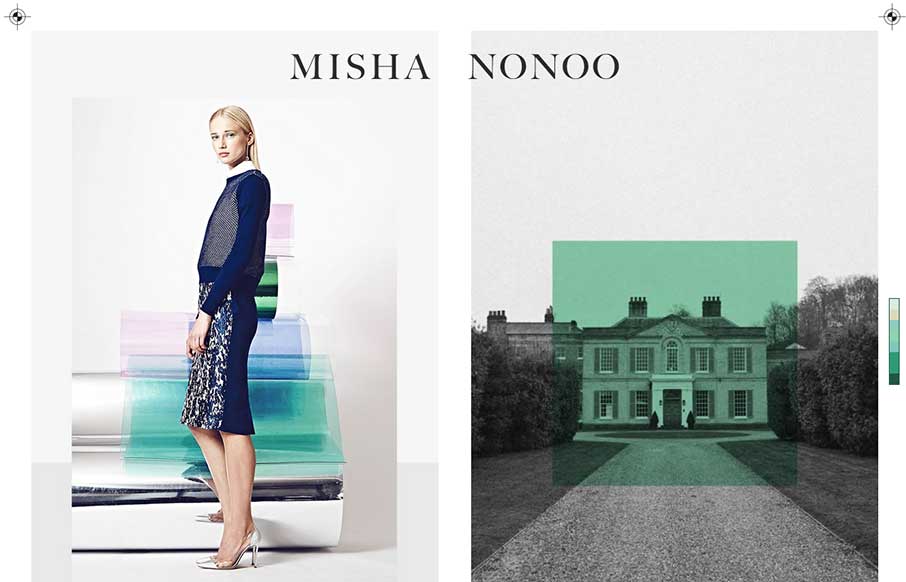
by Aaron Griswold | Sep 19, 2014 | Gallery
This is a smart and beautiful site. It packs in all the elements of a slick magazine, but on one page. I’m not usually a fan of modals, but these work because of the “static” nature of the site.
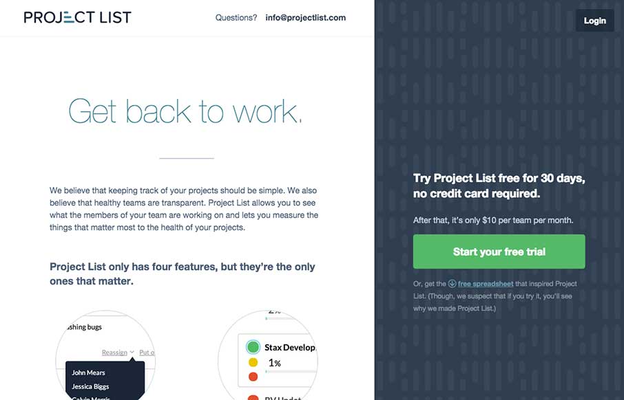
by Gene Crawford | Sep 10, 2014 | Gallery
There is a lot to love about this website for Project List. I like the split screen design, I haven’t seen something like this done very well, until today. I also really dig the interaction design on the sign up form process. That’s some good UX. With a...
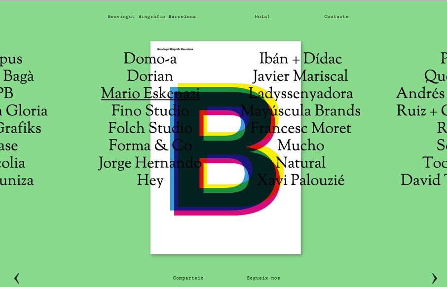
by Gene Crawford | Sep 2, 2014 | Gallery
A compelling visual way to navigate a site like this. I like that it’s different and it somehow actually feels like it helps feed into the literary vibe of the site too.
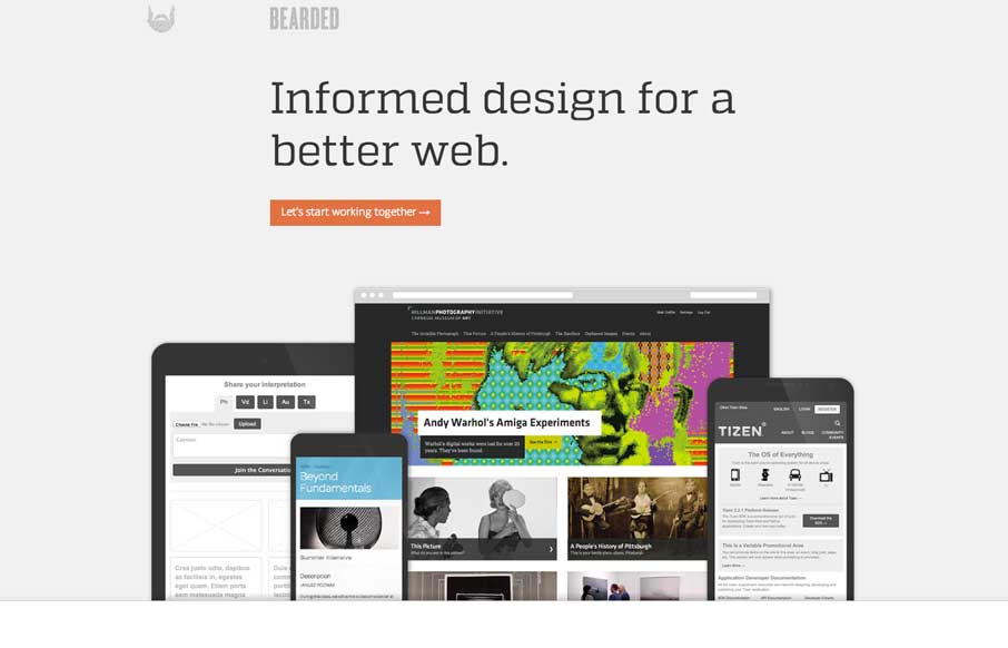
by Gene Crawford | Aug 26, 2014 | Gallery
New Bearded. ’nuff said. But really, it’s super slick and simplified beauty. It’s this type of thing that makes me really love hate these guys. They even had the gaul to give us a pretty good write up about the redesign too: I’m constantly reminded...
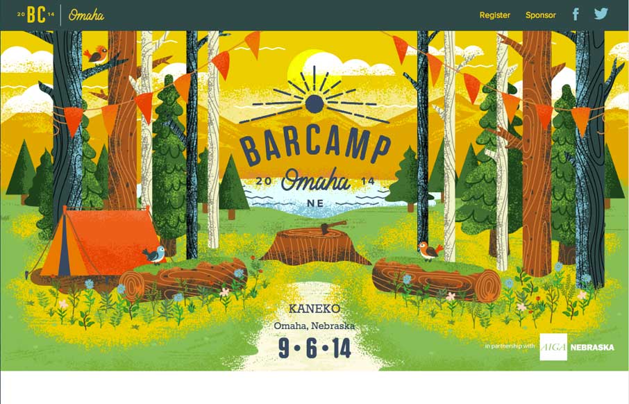
by Gene Crawford | Aug 22, 2014 | Gallery
The Barcamp Omaha website is just beautiful. I love just about every aspect to it, but the thing that I dig most is the illustration work that sets the tone. It promises a pretty well organized Barcamp; quality is driven home via the visual branding. I only wish I...