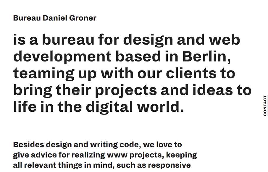
by Gene Crawford | Sep 1, 2015 | Gallery, Portfolio
The vibe of this site design is very unique feeling to me. I like that it’s 90% copy as you first load the thing then the layout of the elements are unique. I like the mouse over effect on the main images as you move around on the page too.
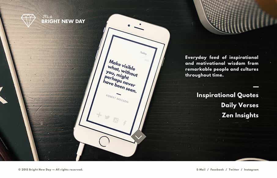
by Gene Crawford | Aug 24, 2015 | Gallery
Cool app website, it’s fairly typical in that it’s a single(ish) page however it has plenty of great imagery and shows off what the app does quite nicely. You can almost decide before downloading the app if you’ll dig it or not, so that’s a...
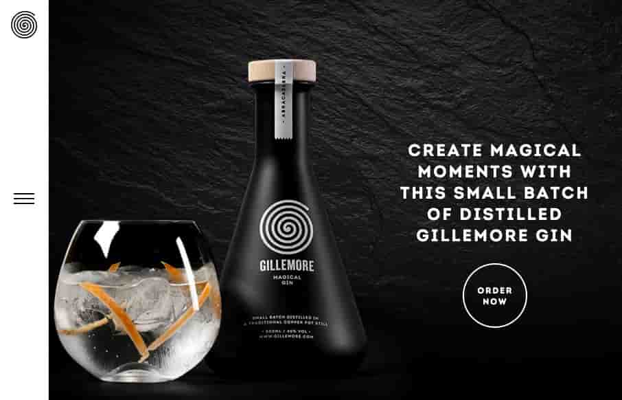
by Gene Crawford | Aug 21, 2015 | Food and Beverage, Gallery
Nice upscale look for the Gillemore Gin’s website. I like the black/dark vibe, it really aides to the uniqueness of what the product looks like. Along side the slightly non-traditional feeling nav in the left hand side tray pattern the approach matches the look...
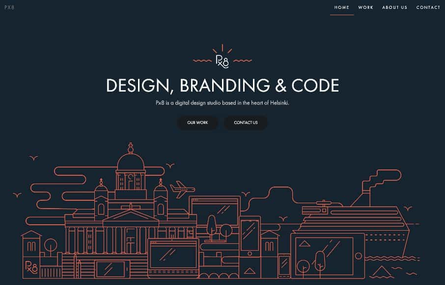
by Gene Crawford | Aug 19, 2015 | Gallery
Beautiful illustration work and coloring make this site sign. It has a very nice core to the design in that the grid and breaks are solidly built. Match some good typography and subtle photography treatment and it’s pretty sweet. With talented illustrator John...

by Gene Crawford | Aug 18, 2015 | Gallery
I like the way this site layout feels almost like a new conceptual approach, much like the app seems to be. I dig the meta-ness of this. I like a lot about how they’ve managed the design across screen widths, and if you scale the page down in your browser the...