by Gene Crawford | Sep 23, 2015 | Gallery
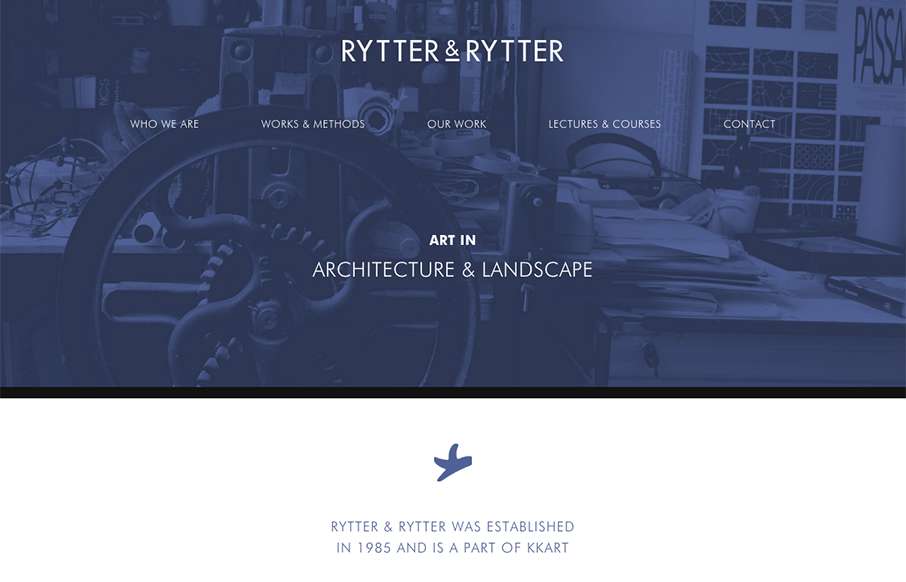
Pretty clever single page layout for Rytter & Rytter. I like the way the sections are laid out as you scroll down, the flow feels nice. My favorite section is the pictures of their work, the way they’re cataloged and displayed is just clever.

by Gene Crawford | Sep 23, 2015 | Gallery
What a beautiful yet simple layout for Think with Google. I love this, material design in play as well here. Well balanced sections and plenty of space between elements make this easy to scan, read and remember.

by Gene Crawford | Sep 22, 2015 | Gallery, Portfolio
Pretty cool, the first site i’ve seen using the “.guru” domain. Also I like how he asks for your first name before you go deeper into the site, then rolls you right into case studies. Pretty clean and smooth experience overall too. From the Designer:...
by Gene Crawford | Sep 22, 2015 | Gallery
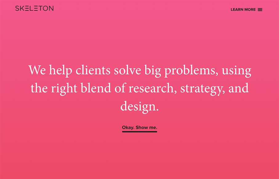
Clear layout and hip colors and type make the Skeleton website stand out. I like the focus on the case studies first – after all it’s what you want people to check out. I dig that you get a bevy of info after you make your way past those 3 project...

by Gene Crawford | Sep 21, 2015 | Gallery
Nice use of images and supporting graphical elements. The flowers and website element colors match up with the photography really well, that’s not easy to get done. I like the way it scrolls rhythm wise as well as slight parallax scroll on the header...
