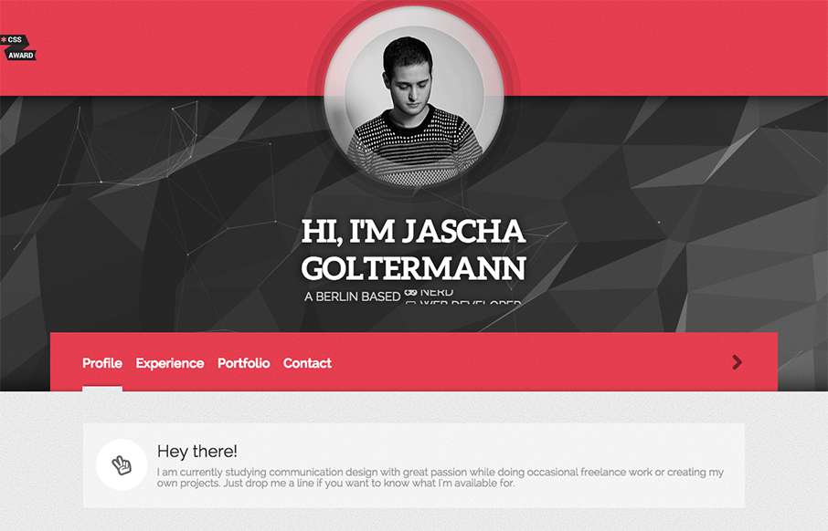
by Aaron Griswold | Oct 7, 2015 | Gallery, Portfolio
Looking at Berlin’s designer Jascha Goltermann’s portfolio site, I’m curious to see where he’ll be in 5 years. Reason being, this site has some elements that are totally different from other portfolio sites we see, with out being too out there....
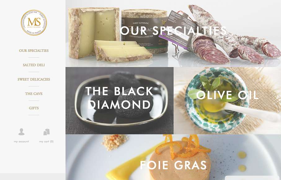
by Aaron Griswold | Oct 7, 2015 | Food and Beverage, Gallery
This site from Marie Severac, a gastro e-commerce store out of France (not sure if a physical location too), is simple and clean – which is great when you’re showcasing things like specialty foods. I think there are a few missing pages, but I like the...
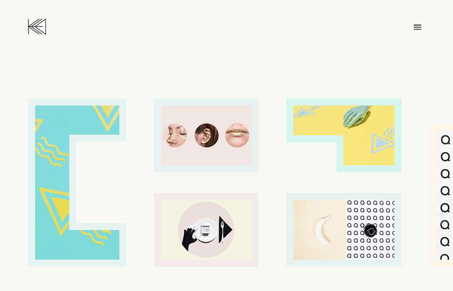
by Aaron Griswold | Oct 7, 2015 | Gallery, Portfolio
“One of these kids is doing her own thing…” and for Kata Farkas out of New York, that’s a good thing. This portfolio site is very experimental, from the side scrolling, to the About page being very “fluid” – even if it’s...
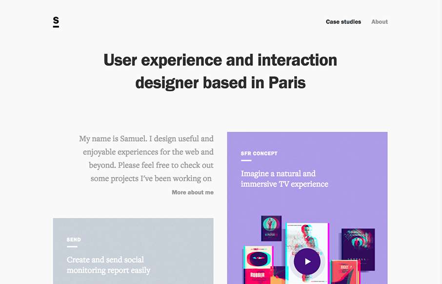
by Aaron Griswold | Oct 6, 2015 | Gallery, Portfolio
I really like how designers are putting some time into their portfolios, and especially the case study parts – like how Samuel Medvedowsky’s Work Portfolio pages use both full and “fixed” width to tell his stories. More so than that, it’s...
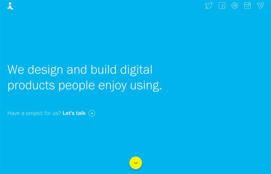
by Aaron Griswold | Oct 6, 2015 | Design Firm, Gallery
There are times when we see sites like the Indicius, and I think – way too busy, what’s going on… I don’t feel like that with this one – especially since there is no other navigation on the site. Really love the movement of the Case Study...