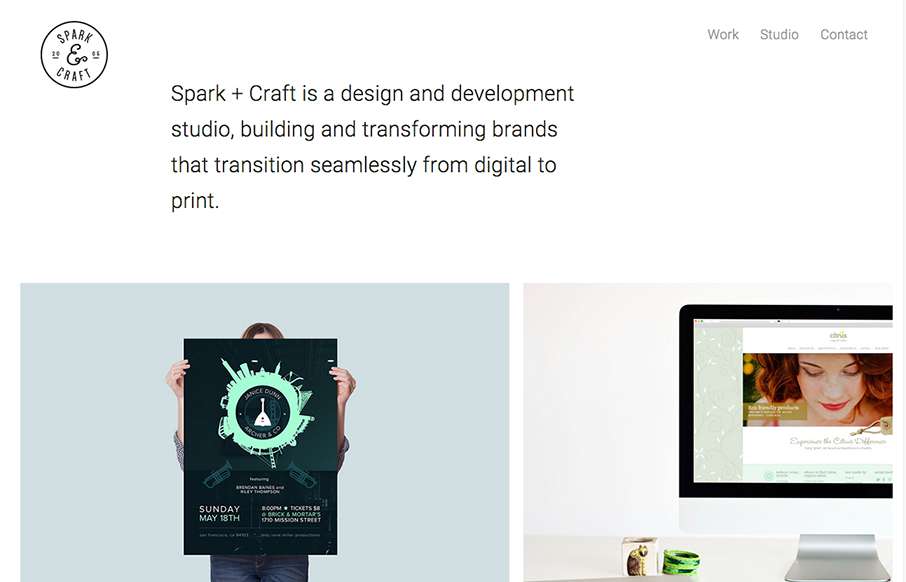
by Aaron Griswold | Oct 6, 2015 | Gallery
Cool and tight site from Andre Ventura, aka Spark and Craft Studio out of Georgia. Really like the block design, and the Work detail pages are really crisp – and like how the logo doesn’t interfere with the images (like we’ve seen a lot lately on...
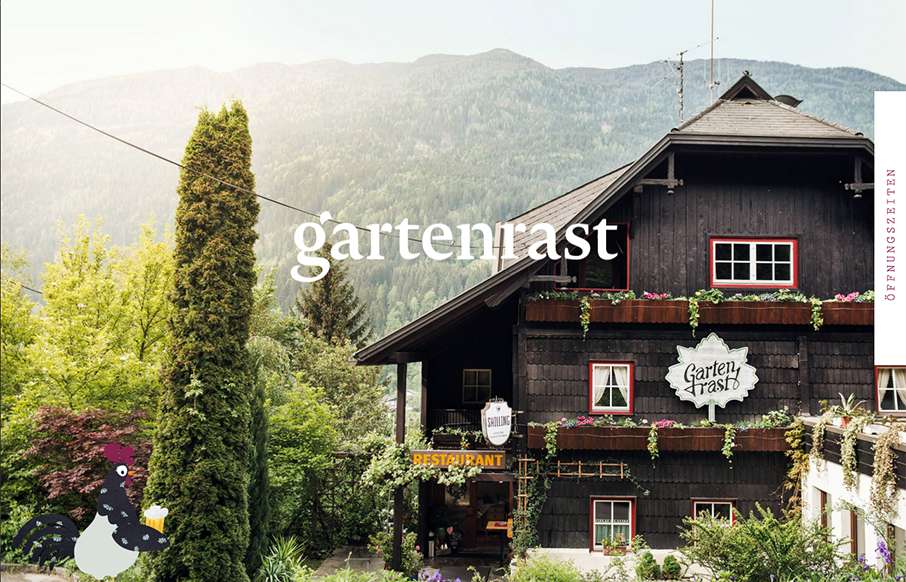
by Aaron Griswold | Oct 5, 2015 | Gallery, Travel
Clean, and a lot of gut white space. Love the hamburger / fork-knife-spoon menu – and roosters too.
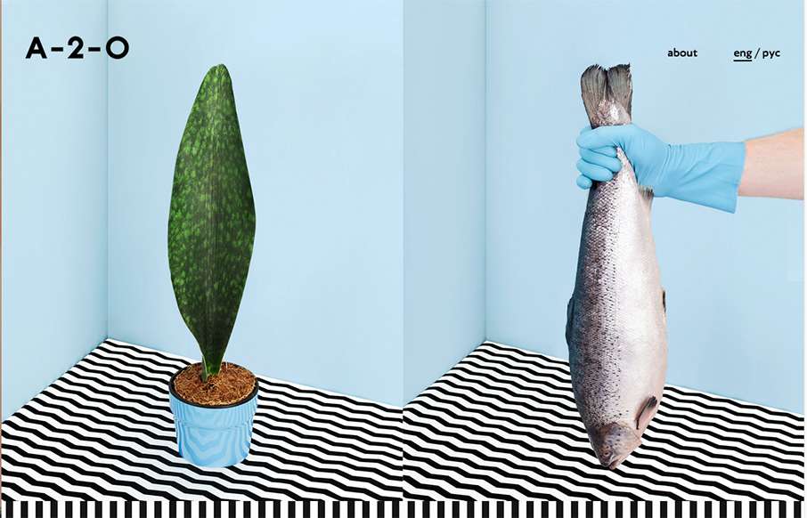
by Gene Crawford | Oct 5, 2015 | Design Firm, Gallery
Pretty unique interaction choices on A-2-). It’s different, i’m not sure it doesn’t work though. I like how the cursor changes based on moving over a link, I don’t like how this is a 100% diversion from what the user has always experienced....

by Aaron Griswold | Oct 2, 2015 | Gallery, Product
We’ve been having a lot of router issues here lately – this is not a product endorsement, but maybe Google’s OnHub is a solution for us? Either way – cool one pager site for the product. I like the intro, how the pre-loader turns into a video...
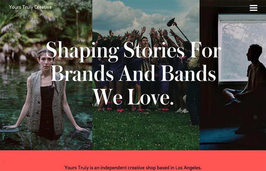
by Aaron Griswold | Oct 1, 2015 | Gallery
Really great editorial website layout. I love how the text flows between the images and the white space – and really love the rest of the text work on the other pages – it’s not totally bound to a grid.