
by Gene Crawford | Jun 20, 2012 | Gallery, Travel
This is a very thorough responsive design solution. The main navigation changes alone are worth reviewing in some detail. Plus there is just a ton of info/elements on the home page that get handled well through each screen size transition.
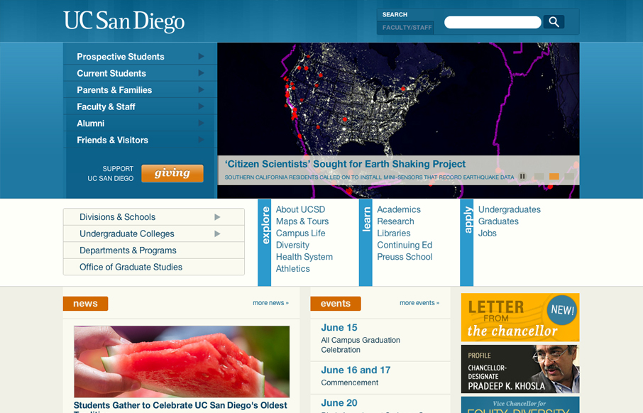
by Gene Crawford | Jun 20, 2012 | Education, Gallery
The UC San Diego website is very modular and square which is softened up a bit by the colors and a few slightly rounded corners here and there. There are a few sections of the home page that fall into a sort of “i’m just tired of designing” sort of...

by Luke Williams | Jun 19, 2012 | Gallery
What a brilliant idea, looks great and works well with rotation. Even better they make a mobile friendly version too, a smart and thoroughly enjoyable design.

by Gene Crawford | Jun 19, 2012 | Education, Gallery
University websites are a great place to study how large sprawling organizations with tons of content handle things. In this case the change in navigation design is largely from the wide horizontal nav structure with drop-down sub elements to the iPhone screen sized...

by Gene Crawford | Jun 18, 2012 | Entertainment, Gallery
What a great website to study the different screen size experiences with. I love the three major size designs here. The wider has the nice nav inline next to the logo area and then as you scale in it slides under the logo. With the final iPhone sized screen having the...
