by Gene Crawford | Jul 3, 2012 | Gallery
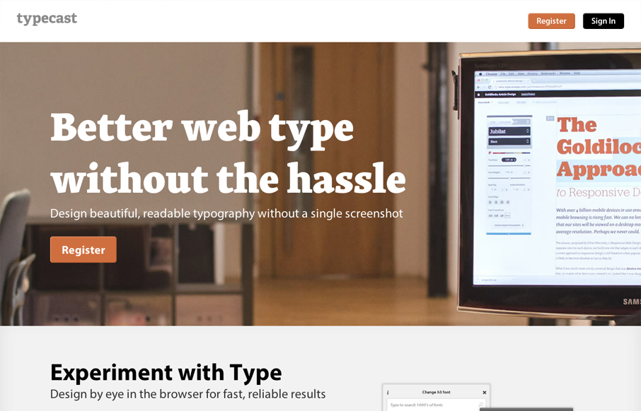
Aside from what looks like a brilliant app. The typecastapp.com website is very well produced. I like asymmetrical layout a lot, the right side is heavy with visuals and it really helps to draw you down the page more. Keeping your eyes focused on that right side...
by Gene Crawford | Jun 27, 2012 | Gallery
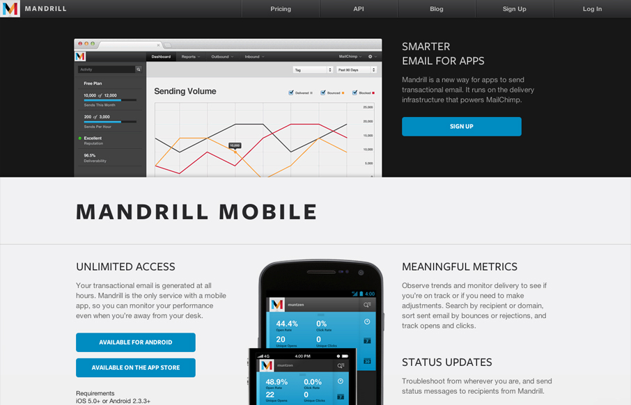
The Mandrill site is a such a nice product/app website. The experience is clean with a few little visual treats here and there, like the slight parallax type image shift on the two mobile phone images. Good responsive design too. I particularly like the signup form...
by Gene Crawford | Jun 27, 2012 | Gallery
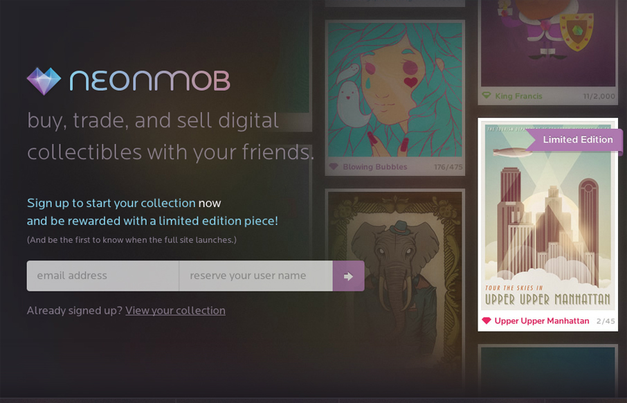
I love the interactions on NeonMob. They’re simple color shifts and sliding shapes but the overall experience is delightful. That’s really all it takes sometimes to really draw you into singing up. In this case, onboarding by great interactions, it’s...
by Gene Crawford | Jun 27, 2012 | Gallery
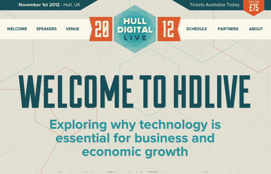
The Hull Digital Live conference website is a nice responsive top navigation design to study. I like the pattern here of going with the fixed top nav then as you get smaller screen widths, it still stays fixed but folds out with a slight transparency on it. It’s...
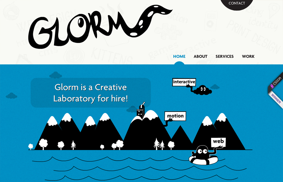
by Giovanni DiFeterici | Jun 22, 2012 | Gallery
This site is hilarious and incredibly entertaining. After 10 seconds you get a real sense of what they do and how they do it, which is perfect for a portfolio site. It’s also a perfect case study for multiple types of web based animation techniques. Some of the...
