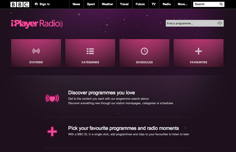
by Gene Crawford | Oct 12, 2012 | Entertainment, Gallery
Well, well, well: looks like the BBC Radio site’s just launched a fine-lookin’ responsive site. bbc.co.uk/radio/ /via @paulrobertlloyd— Responsive Design (@RWD) October 8, 2012 While this isn’t a typical “website” it’s still worthy of...
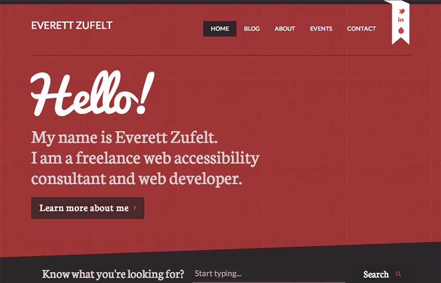
by Gene Crawford | Oct 11, 2012 | Blog, Gallery
The red and black design always works IMHO. Mixed with a nice grid and a diagonal it just comes off as smart. I like the subtle grid pattern that can be seen behind the design and the type mix works well with the grid vibe. I like that search form design a lot. Great...
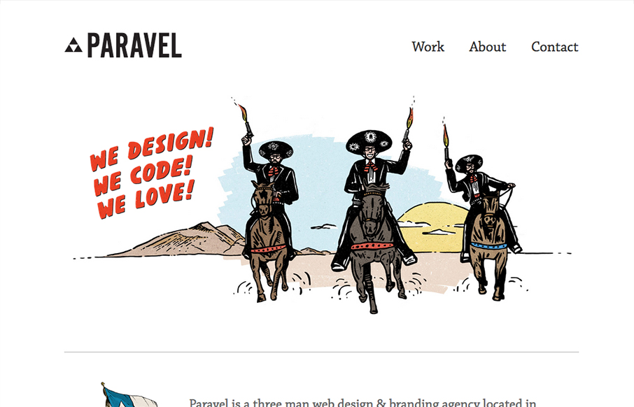
by Gene Crawford | Oct 10, 2012 | Gallery
New update for the Paravel team’s website. They’ve simplified what was there before and boiled it all down to just what’s needed to communicate what it is they do and have done. Telling their story quickly with a super badass illustration. The thing...
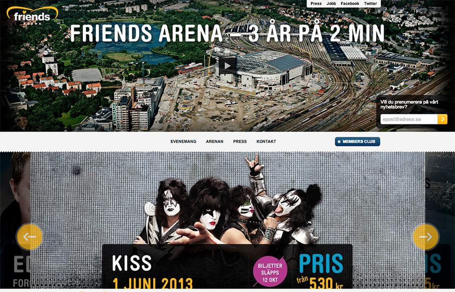
by Gene Crawford | Oct 10, 2012 | Gallery
Those who are about to rock, we salute you: check out the responsive site for Sweden’s national arena! friendsarena.se /via @skogberg— Responsive Design (@RWD) October 8, 2012 I like how the header/navigation goes from being under the main image to being fixed...
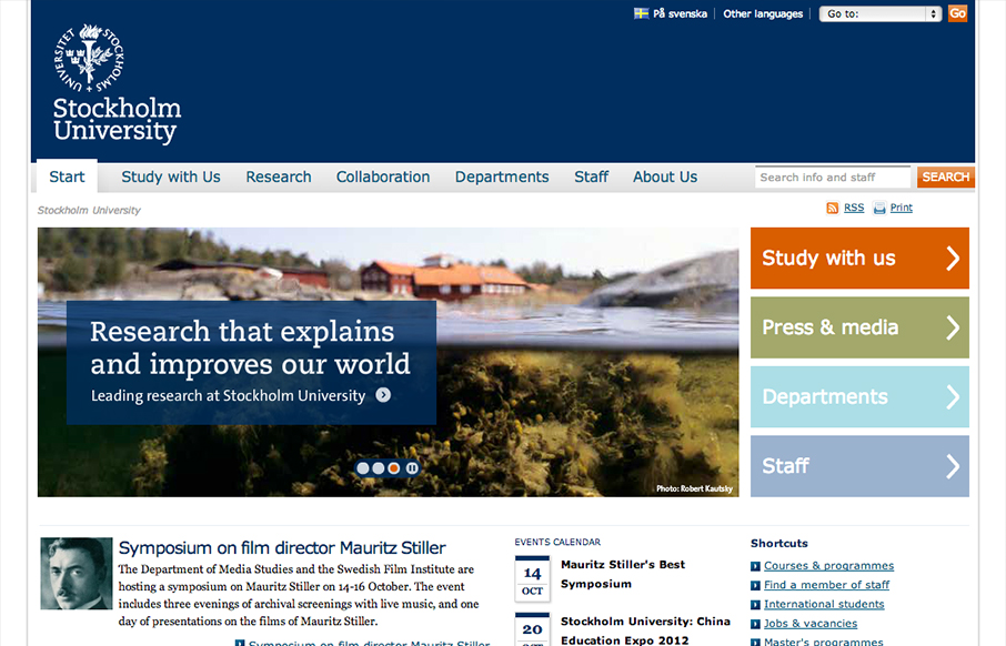
by Gene Crawford | Oct 9, 2012 | Education, Gallery
Looks like @stockholm_uni just went responsive! su.se/english/ /via @jan_lof(Some nice adaptation patterns in there, by the way.)— Responsive Design (@RWD) October 8, 2012 Really dig into the main “hero” area and main navigation and look at the...