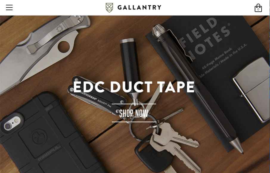
by Gene Crawford | Aug 1, 2016 | Gallery, Shopping
Pretty standard faire as far as an ecommerce layout goes. But I love the way the photography and overall simplification and coloring of the website itself is done. It all goes seamlessly together. That footer area too, nice.
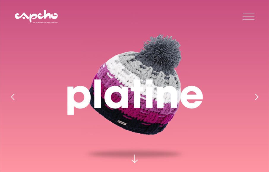
by Gene Crawford | Aug 1, 2016 | Fashion, Gallery
Man, really cool interaction parts to this website for stocking caps. Very cool stuff, keeps you browsing. I love the way the images slide around as you scroll.

by Gene Crawford | Aug 1, 2016 | Gallery
Sometimes you have to go for a clean and clear presentation of a topic and content. The Heads Up Guys website is just that, all business. Good looking work.
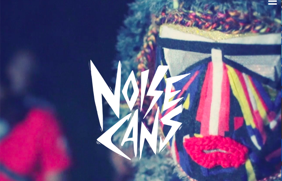
by Gene Crawford | Jul 29, 2016 | Gallery, Music
This site is pretty weird, but I dig it. I like the colors and the video/imagery. The submitted synopsis really says it all for me: The Charles NYC paired artistic “Low-Tech” photo and animation filters with a combination of retro and futuristic type...

by Gene Crawford | Jul 28, 2016 | Gallery
Beautiful website design for meltmedia. I love every aspect of this website. There’s plenty of little detail work to keep you into it. Like the effect used on the team headshots, love that. Then there’s the case studies too, beautiful look and feel here,...