by Gene Crawford | Mar 12, 2013 | Gallery
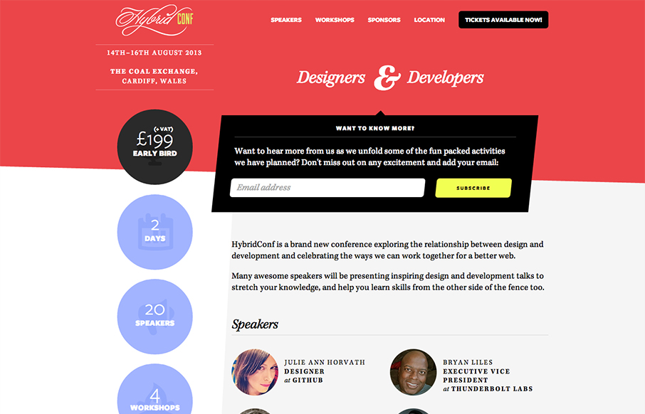
Beautiful asymmetrical design here for the Hybrid Conf website. I love it when simple design solutions wind up having such great dynamic results. The offset sidebar with the rounded profile pics just set the whole thing off right. I like the big subscribe box and the...
by Gene Crawford | Mar 12, 2013 | Gallery
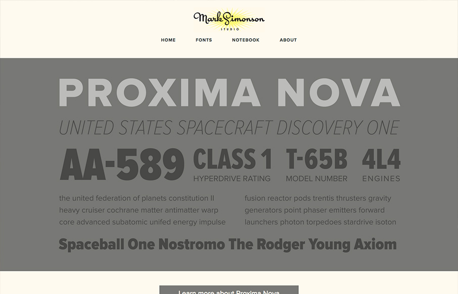
The site’s layout was planned from scratch to be fully-flexible and responsive. Users can easily browse Mark’s typefaces and read his articles from any modern device. We’re particularly fond of how the fonts page turned out. – From Parvel’s Post on the...
by Gene Crawford | Mar 11, 2013 | Education, Gallery
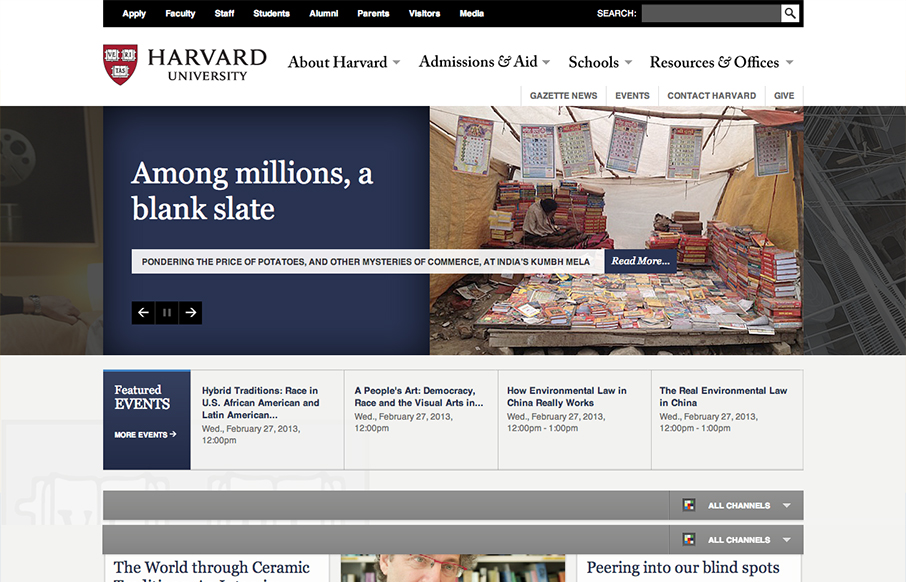
This is a well structured website. The grid is clear and easy to visually track the different sections of links. College websites are traditionally over-packed with links, this one is no exception but it’s designed in visual chunks so you can take it all in. I...
by Giovanni DiFeterici | Mar 8, 2013 | Gallery, Portfolio
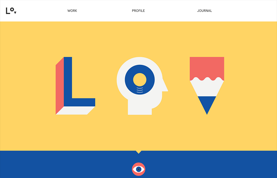
lorenzoverzini.com is great. I love this site. Don’t get me wrong, it’s not the most groundbreaking design: minimal, super-flat, graphic, and spare. However, the balance of color, content and style is superb. I love the small SVG animations. They activate...

by Giovanni DiFeterici | Mar 7, 2013 | Gallery
We have always admired Sarah’s (@sazzy) design sensibilities and her activity in the community. youknowwhodesign.com is a perfect example of what’s to love about her work. The design is simple, beautifully responsive and precise. Even the use of a bottom...
