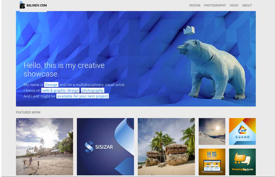
by Gene Crawford | Mar 18, 2014 | Gallery, Portfolio
Clever looking design. I like the Isotope interface piece and how it’s used, in that the design isn’t just based on using it. Beautiful work too.
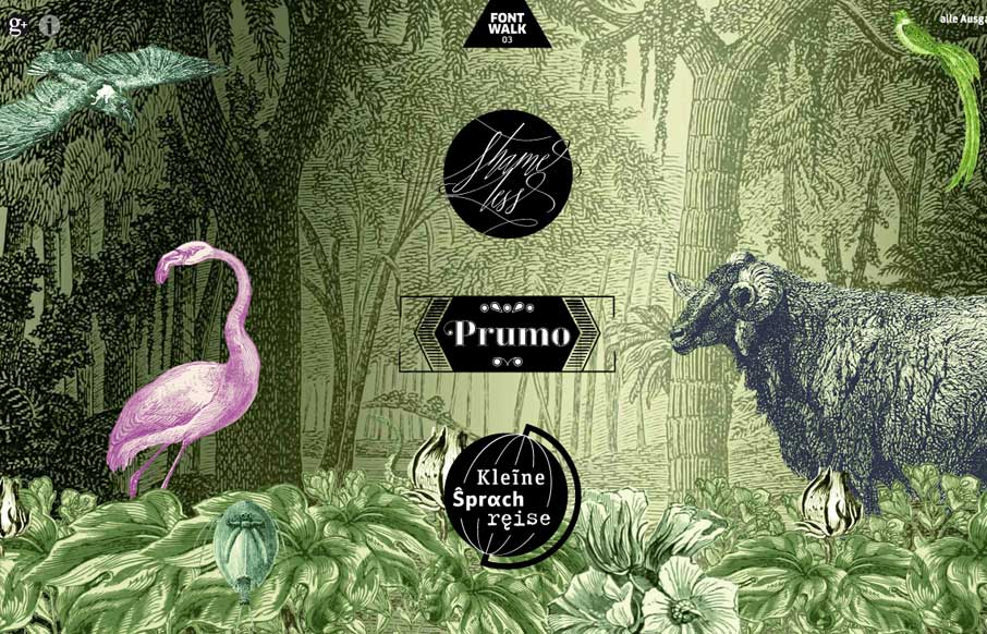
by Gene Crawford | Mar 18, 2014 | Gallery
Really cool way to show off the fonts. It is almost indeed like taking a walk or a tour. Lovely.
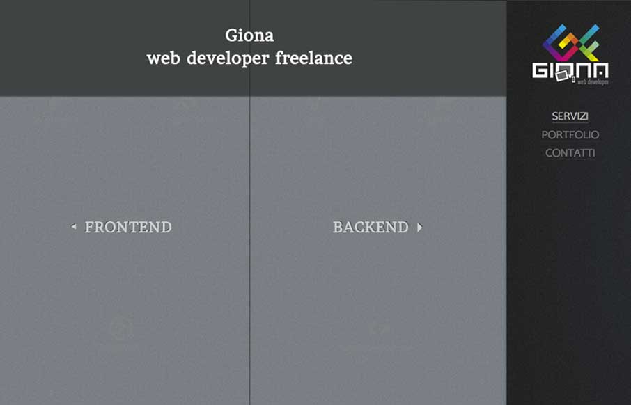
by Gene Crawford | Mar 18, 2014 | Gallery
Really nifty interaction design. I like how the interactions allow you to play, the left and right sides of what this person can do are represented pretty well with this design too. It’s also responsive which looks like it was a lot of work.
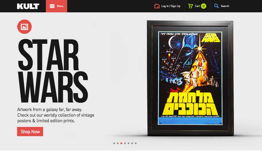
by Gene Crawford | Mar 17, 2014 | Gallery
Good simple layout, just kind of a blocky and bold presentation of stuff. What’s interesting to me is how when you interact with the menu it grays out the content, keeping you focused on the menu navigation itself. What do you guys think of that?
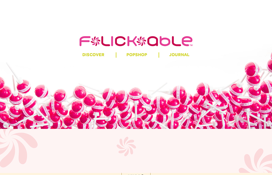
by Gene Crawford | Mar 17, 2014 | Gallery
You don’t see too many “fashion” sites that are decently done. If you have, please send ’em in to us. This one is of course over the top with all the “pop” stuff but it is well done. It’s responsive, and has some nifty...