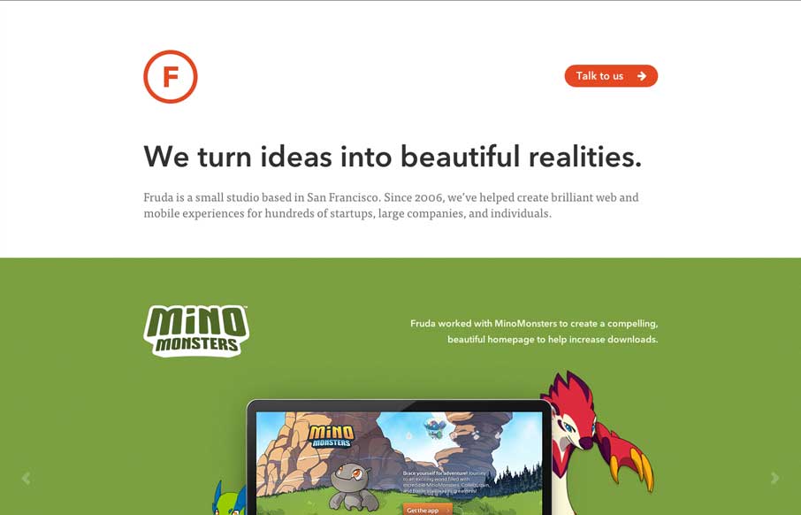
by Gene Crawford | May 14, 2014 | Gallery
Beautifully simple site. I love how the work is what it’s all bout for Fruda. Single page and solid clean design close out the sale here.
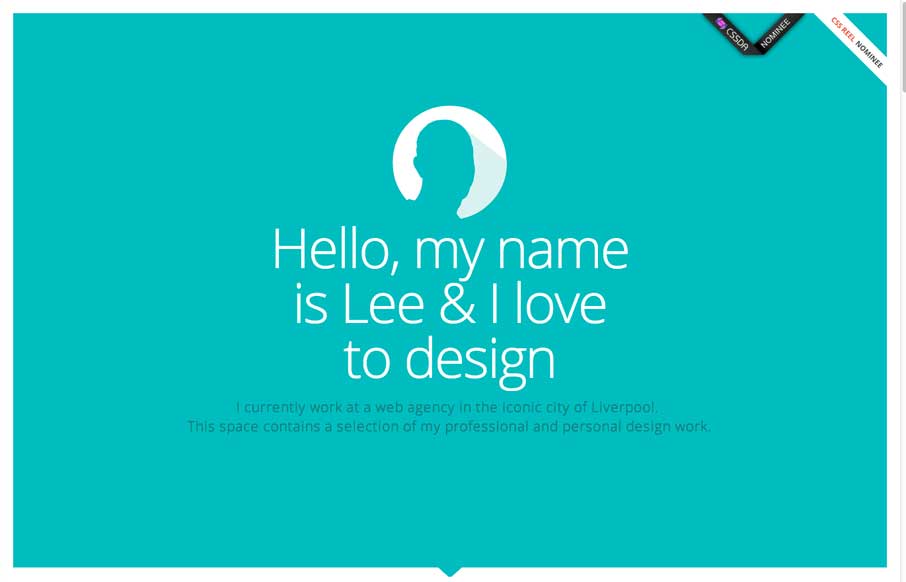
by Gene Crawford | May 14, 2014 | Gallery
Nice clean layout with some interesting interaction; where the work samples slide into view as you scroll. I like the primary feeling color palette and how it’s responsive. I’m not sure it holds up super well at the smaller screen widths but overall...
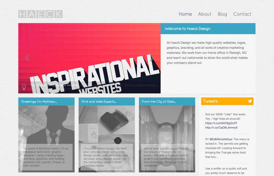
by Gene Crawford | May 13, 2014 | Gallery
Kind of a weird look for a web design company’s site. It feels very much like a blog or news site. However I kind of like that, by focusing on the usefulness of the content it’s putting the most important part first – the words. Debate it however you...

by Aaron Griswold | May 13, 2014 | Gallery
Pretty clever use of loading animation effects as you scroll down this site for the first time. It helps take what is a pretty hard edged and clean design and give it some life. This kind of interactive feel is what gives stuff depth sometimes – you can take it...
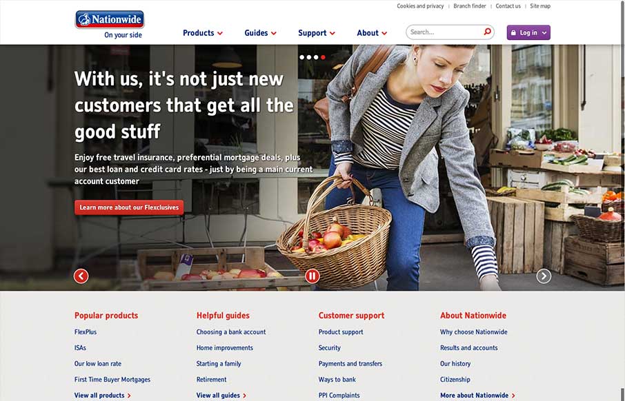
by Matt Keogh | May 12, 2014 | Gallery
In comparison to other major banking websites (in the UK at least) the recently re-designed Nationwide website is brave and modern. There’s nothing particularly fancy about it which in a way is what you’d expect and want from a website such as this. It is...