by Aaron Griswold | Dec 18, 2014 | Design Firm, Gallery
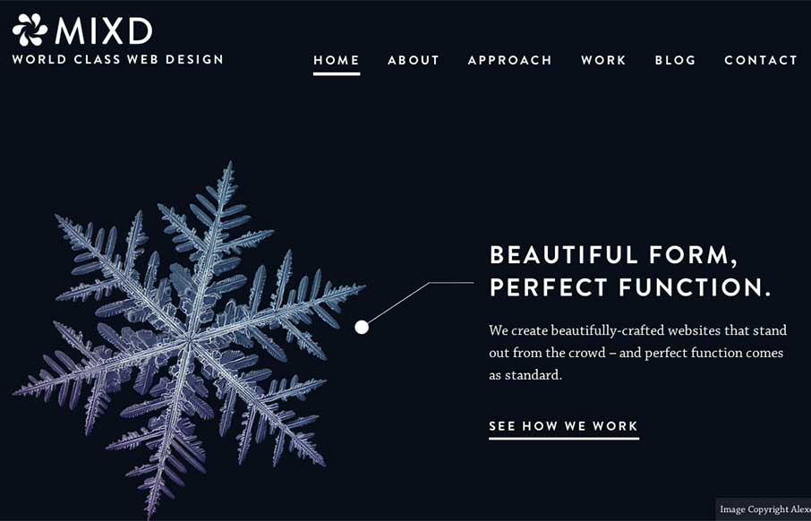
This is from the Mixd design house out of North Yorkshire, UK. I like how each page has it’s own initial background color, while still keeping the same aesthetic throughout the site. Also like that they must maintain the site and switch out the home page, that...
by Aaron Griswold | Dec 18, 2014 | Gallery, Product
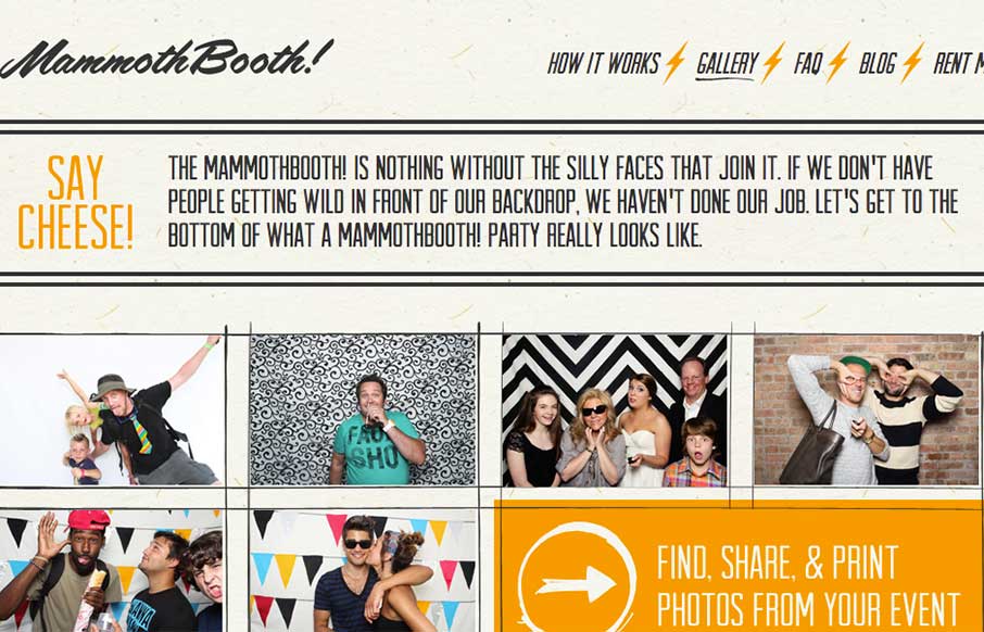
Listen… good marketing is this: Do Not Press Button. What’s the first thing you want to do? This is how the Mammoth Booth site starts out – good irreverence coupled with some nifty illustration and CSS animation, and then the pay-off: an explosion of...

by Aaron Griswold | Dec 17, 2014 | Gallery
Listen – we don’t normally do wedding / proposal sites – but this one from Mike Pechardo out of the San Francisco area is really well done. Looks like he spent a lot of time to make everything come together seamlessly on the web side – hope...
by Aaron Griswold | Dec 16, 2014 | Gallery, Sports/Recreation, Travel
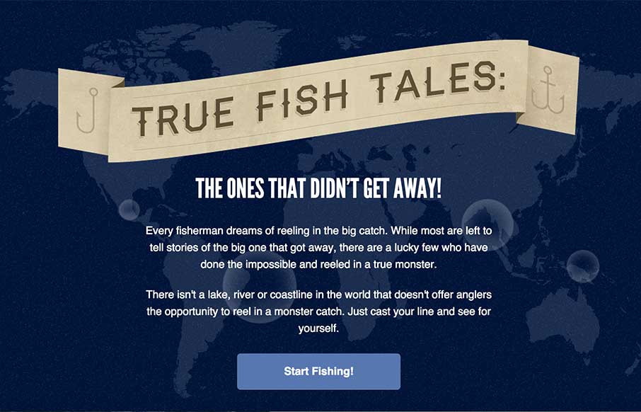
So.. here’s the story… this site is all about true whopper fish tales… “the lucky few who have done the impossible and reeled in a true monster.” Yeah sure, great on the CSS animation, map and interesting way they present the stories so...
by Aaron Griswold | Dec 15, 2014 | Gallery
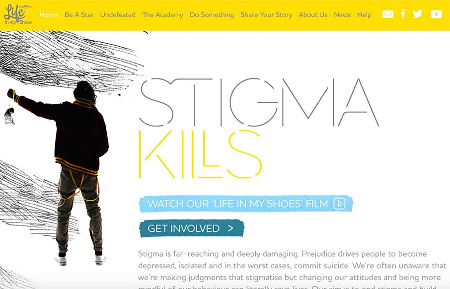
I like the contrast of using stark white space and texture in the background and around important shapes/spaces on the page itself. Contrast can go really far as a design tool.
