
by Aaron Griswold | Apr 20, 2015 | Gallery
This Beagle app site (A tool for creating better proposals) looks to be designed by Podio in conjunction with Spring / Summer out of Copenhagen, Denmark. Listen, scroll-jacking as a designer may not be your thing, but when you see how tight this site is – you...
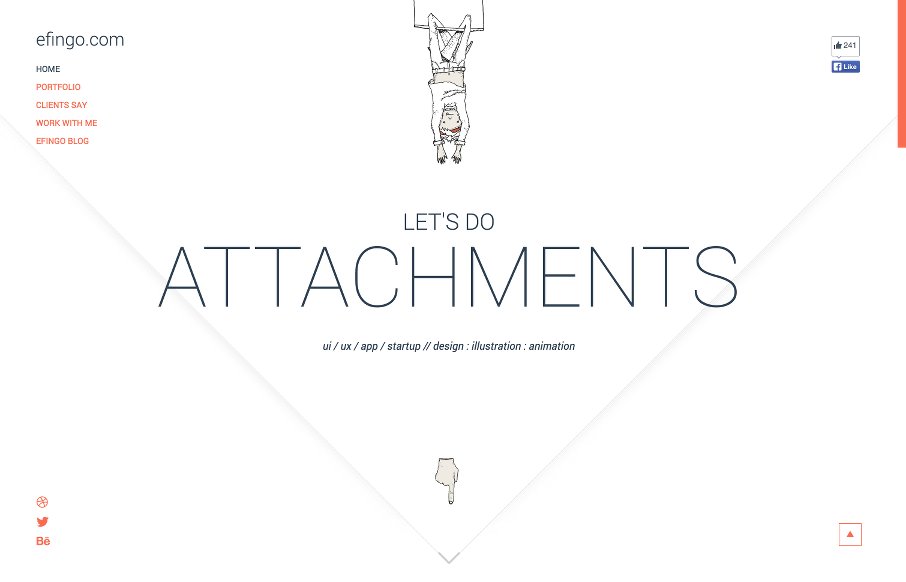
by Aaron Griswold | Apr 20, 2015 | Gallery
Like this portfolio site from Catalin Boroi out of Bucharest – his illustrations are cool – but also like how it looks like an envelope to start with, but opens to a clean website with some vertical nav after that. From the Designer: efingo is my personal...
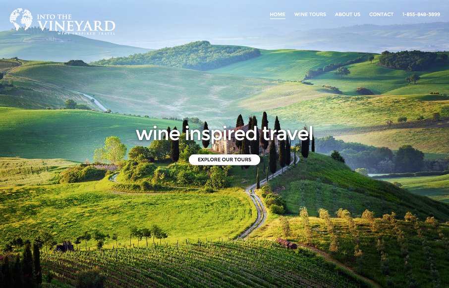
by Aaron Griswold | Apr 20, 2015 | Gallery, Travel
After putting on ConvergeSE last week, needed a decent site to ease into gallery reviews for UMS – Into The Vineyard out of Vancouver did that for me. My wife and I love wine and travel – so good combo. I like the flow and imagery of the site. And I know...

by Aaron Griswold | Apr 16, 2015 | Gallery
We don’t get may sites to review out of Indonesia, so we’re happy to see the WEBARQ site out of Jakarta (and I personally have good memories of there and Bali… but that’s for another day). They have some cool artwork on the site that is...
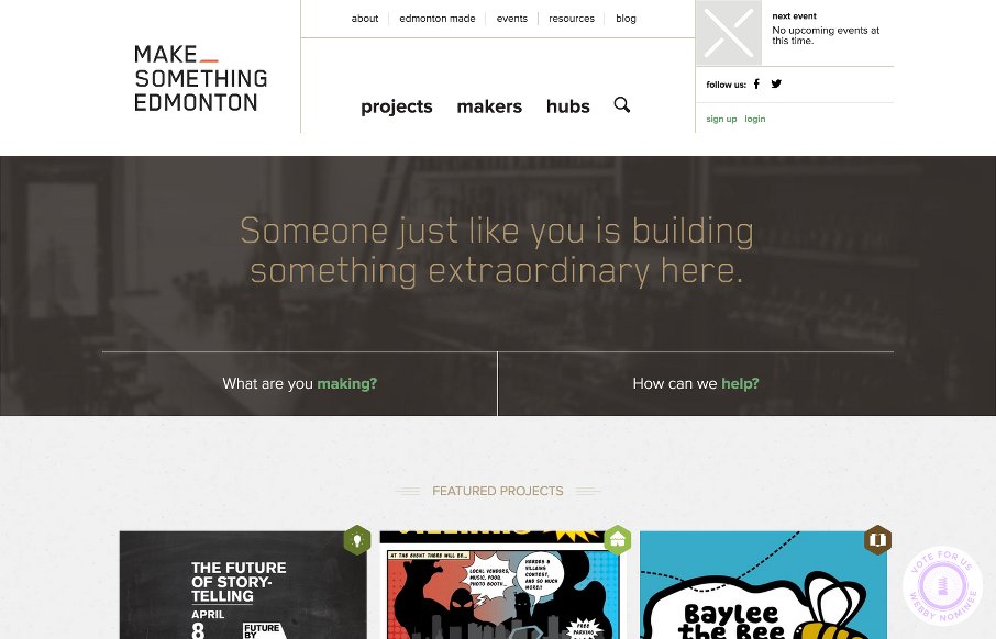
by Aaron Griswold | Apr 15, 2015 | Community / Social Networking, Gallery
Love when a community project gains momentum like the Make Something Edmonton project has. The design is excellent all the way through – take a few moments to “flip” through the site – it’s not like other sites we see here at UMS –...