
by Maria | Feb 27, 2014 | Gallery
You see these nice responsive sites with their sticky nav and circular images and slick transitions and think, “Yeah, that’s cool, they did everything right.” I’ll be honest, you don’t typically see this much content loaded in and still...

by Gene Crawford | Feb 26, 2014 | Gallery
Neat app site design. I really like how the top navigation comes from the bottom(ish) of the space you see after the initial home page area loads. Sliding up to take it’s place at the top of the page. Then the slight parallax behind each screenshot, then how you...
by Gene Crawford | Feb 25, 2014 | Gallery
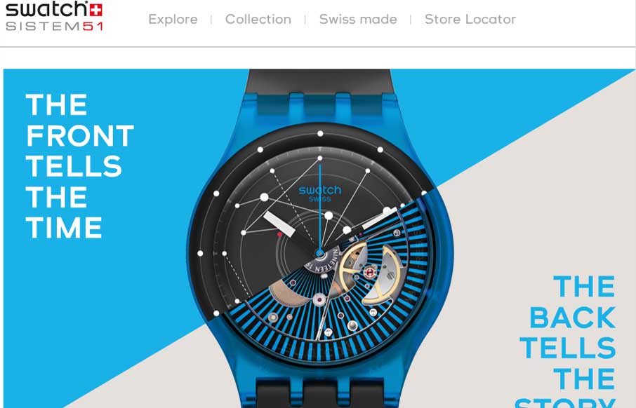
Fun product page for the Swatch SI System Watch. It makes strong use of timed animated images of the watches, letting you get a sense of their tactile quality as you scroll. I also dig the map, click on a store location to see the way the map responds. It’s...

by Giovanni DiFeterici | Feb 25, 2014 | Gallery
Beoplay’s H3 site site is truly beautiful. I’m often against the practice of hijacking the user’s ability to scroll, but the effect works really well on this site. Every ‘page’ is clean and minimal, but provides a very different user...
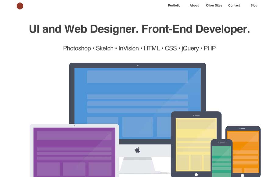
by Giovanni DiFeterici | Feb 24, 2014 | Gallery, Portfolio
This is a great site with beautifully simple interactions. The hover overlays on the work are really soft and lovely and the flat art is engaging without being distracting.