
by Gene Crawford | Apr 8, 2014 | Gallery
Really dig the masonry like layout utilized here. It’s well done. I also like the light touch to the design so that the site itself doesn’t overpower the work displayed. That’s a hard line to walk.

by Gene Crawford | Apr 7, 2014 | Design Firm, Gallery
I really like this new pattern that’s emerging where the main nav changes slightly once you move past the initial page load. I do also dig the interactions placed with each of the main images on the home page too, very smart use of animations.

by Gene Crawford | Apr 1, 2014 | Gallery
I like the overall treatment to this site design. It feels a bit like Microsoft esthetic (but better executed) which is just fine and looks great here.
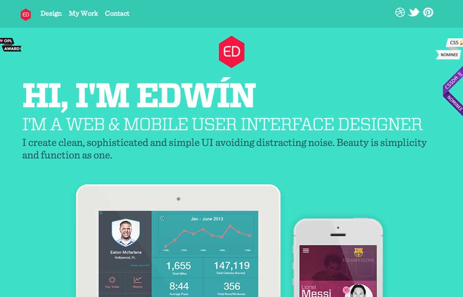
by Gene Crawford | Mar 27, 2014 | Gallery, Portfolio
Nice clean look to this portfolio site. I like the about text on this site, typically on portfolio websites it’s largely useless but on Eddie Diaz’s it’s actually informative. Bravo!

by Giovanni DiFeterici | Mar 20, 2014 | Gallery
Parkeriain.com is a portfolio site with a simple, but well conceived structure. I like how the footer has been strategically used to create a call to action on every page. It’s a small detail, but effective when flipping through the portfolio detail pages. Solid...