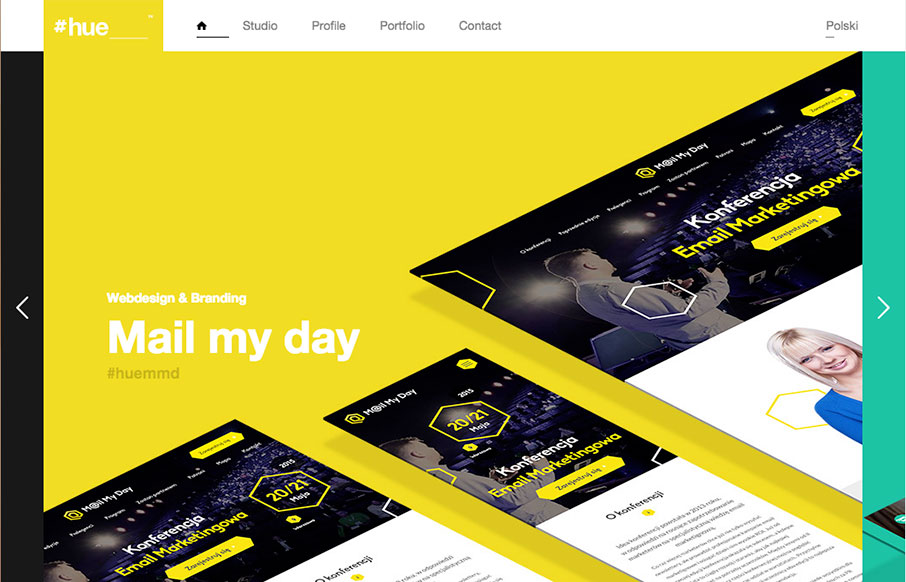
by Gene Crawford | Mar 7, 2016 | Gallery
Pretty cool visual vibe with this design. I like the oversized spaces and blocks of color and even the angled screen shots – they all give it a dynamic feel even though the overall execution is fairly simple and straight forward. Bold colors and typography also...
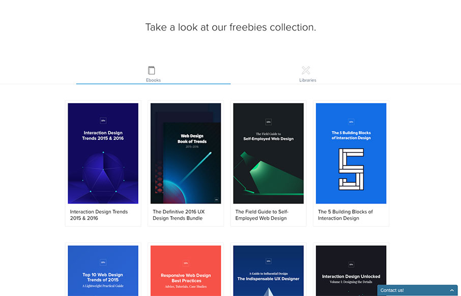
by Aaron Griswold | Jan 11, 2016 | Gallery
So I was doing a little reading this weekend, and I stumbled back on to UXPin. They have an e-book of “The Best Web Designs of 2015-2016” which is excellent work. We’re actually going to use some of their suggested sites in the future, since between...
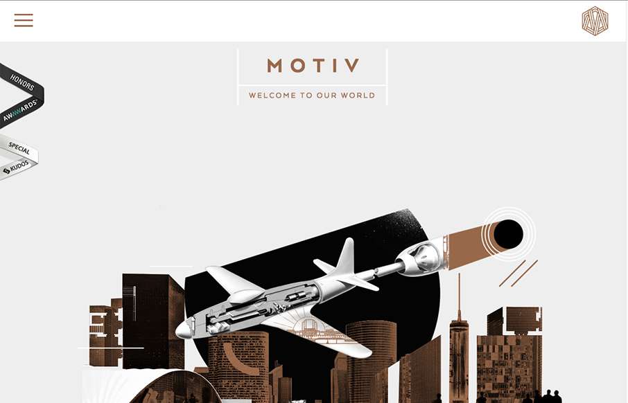
by Gene Crawford | Dec 10, 2015 | Gallery
Sometimes architect’s websites can be crazy and very “flash” like. Remember that? I’m still seeing things like that, particularly in this industry for some reason… The Motive site skirts the line with the page loader on each section and...
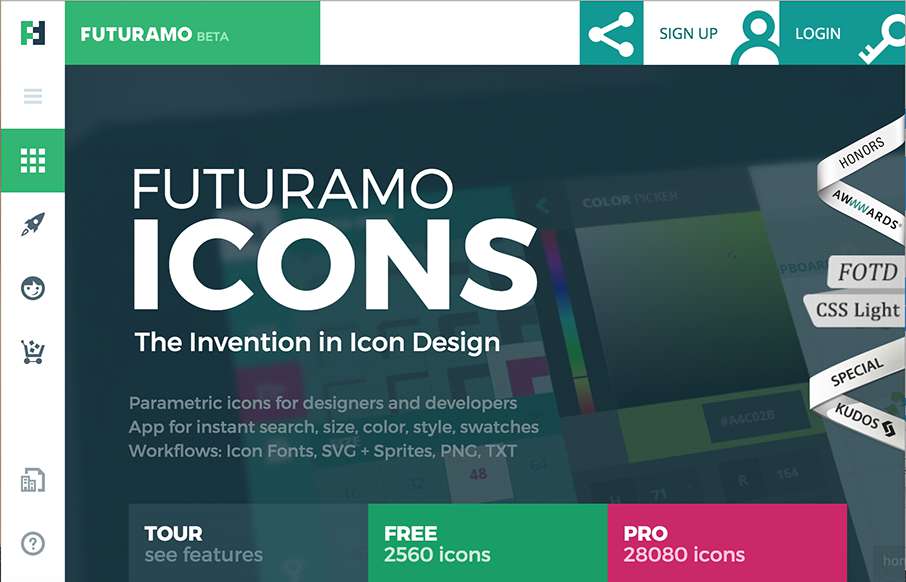
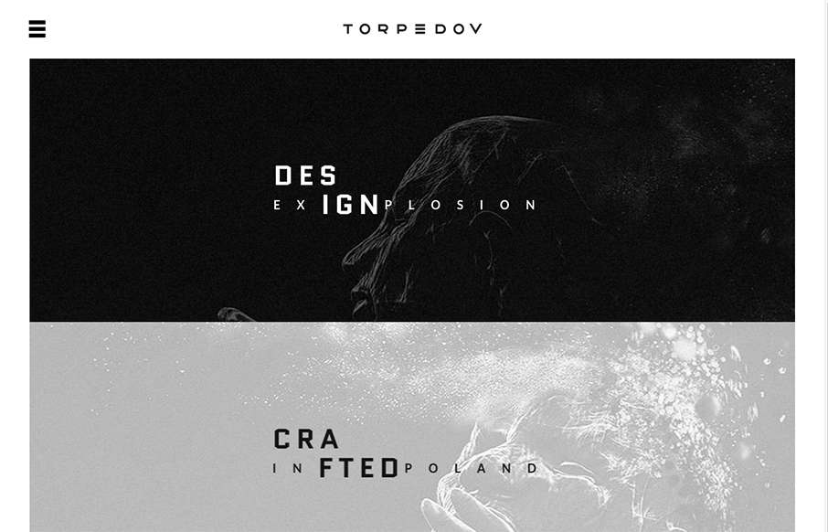
by Aaron Griswold | Oct 22, 2015 | Gallery
Love the look of this site from Futuramo Apps out of Poland. Check out the Tour and Team pages – great use of movement and a totally different look than what we’re used too from “app” product pages. From the Designer: Parametric icons for...
by Gene Crawford | Sep 10, 2015 | Gallery, Portfolio
Pretty solid graphics on the home page, I dig that left or right choice. I also like how he’s used the hamburger menu thing in the logo look as well. It helps tie it together for people. Nice use of slight animations in the case study imagery as well. From the...