
by Aaron Griswold | Nov 12, 2014 | Gallery
Like the use of the gray and green to be a canvas for the portfolio area. And like the Matrix pattern behind their server tech. Do wish that it was responsive – think they could do some cool things with that based on their current layout, and could help with...
by Aaron Griswold | Nov 10, 2014 | Gallery, Sports/Recreation
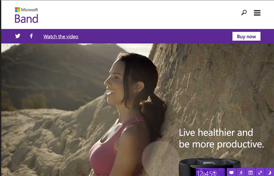
My first thought after going through this site was, “me want.” Which should be the point of a site like this. Then I remembered that I’m looking at the site for a different reason… so… basically, I had a good time on the the site –...
by Aaron Griswold | Nov 10, 2014 | Gallery, Shopping
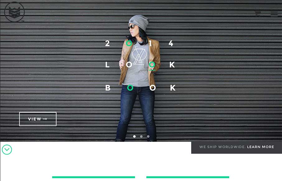
I made my first website in 1996 – it was a shopping site for a crappy private label golf company – it was probably the worst website ever created – but I got to learn HTML, while someone paid me a whole 250 monies. My point… so I really enjoy...

by Aaron Griswold | Nov 4, 2014 | Gallery, Portfolio
What the freak>?! If you’re going to do a portfolio site – make it different. Daniel Snows has accomplished that. I wanted to take a screenshot of the entire site… but you’ll just have to have fun for your self!
by Gene Crawford | Oct 31, 2014 | Gallery
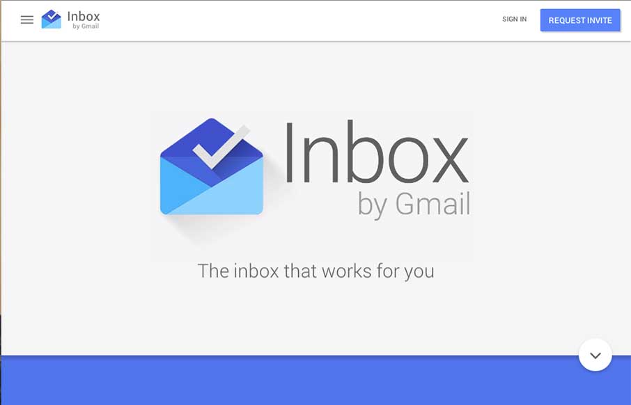
Pretty cool page for Google Inbox. I dig the intro animation that smooths into the main page layout. Interesting approach to the page navigation, working mostly like a slideshow but scrolling down instead of left to right. Not exactly responsive all the way, maybe...